
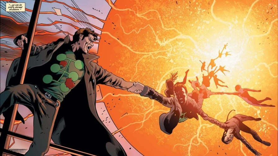
Shh. Do you feel that?
Right there.
A tremendous shift occurred recently— sending ripples in the fabric of Snap as we know it.
No, it isn’t the upcoming Black Order season pass, filled with foreboding and exciting new cards. No, it’s not recent balance changes, buffing underplayed cards, and threatening to make Move an impossibly good one 2099 buff at a time. No…
Multiple Man finally has a variant I don’t hate.
Jamie’s been an underrated favorite X-character of mine for a long time— I knew I needed to celebrate this momentous occasion swiftly, immediately, and even posthaste. And so I thought I’d indulge an obsession of mine with a new article format: my Top 3 Multiple Man Variants (& 3 That Aren't Here Yet).
Part 1:The Top 3 (Dupes Notwithstanding)
Dan Hipp Multiple Man
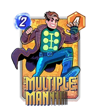
Original Cover: Marvel Snap Commission!
Artist: Dan Hipp
Surprise, surprise, I’m a biased party. Dan Hipp is one of my favorite artists in the game— he’s certainly one of the most distinct, with consistently poppy colors and a clear, fun, simplistic art style with an often deceptively strong eye for dynamism. He’s not for everyone, but for folks who enjoy stylization like I do, he’s consistently a favorite.
But. There are a couple of reasons why this particular Hipp variant stands out for good old Jamie Madrox. It’s got all the hallmarks of Hipp’s strengths, picking a solid, iconic look for him (cough, not his classic costume) and making Jamie look fun as he leaps into action. Maybe most compellingly, the background is… Jamie Madrox. Over and over. And while it might strike some people as a negative that it’s a copy-paste of the foreground, Jamie, that’s what the guy is about. It’s a simple, fun flourish for a character you’ll see copied all over your board when you play him, and I haven’t regretted a second of it since I picked this one up and started Phoenix Force-ing all over the place.
Sports Multiple Man
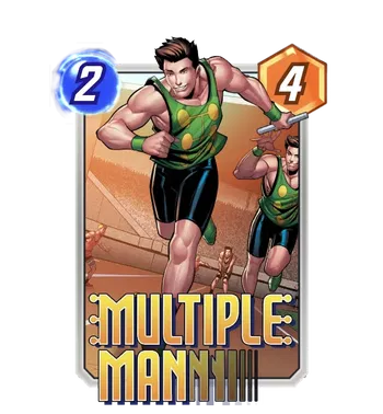
Original Cover: Marvel Snap Commission!
Artist: Eduardo Mello
Colors: Ryan Kinnaird
The other reason the Hipp stands out is that poor Jamie is starved for strong variants. Now, I’m a biased party in more ways than one. While I think the base art style that Second Dinner has commissioned sets an important visual language and standard for the game, I don’t love any variant that keeps that same style but with the character in different outfits.
That is partly why Sports Multiple Man here is such a distant second that I wouldn’t bother running the rest of that race. The concept is fun enough, and Jamie is competently drawn. However, the familiar combination of Eduardo Mello’s linework and Ryan Kinnaird’s coloring veers generic and overstays its welcome— like it often does.
‘X-Factor’ Multiple Man
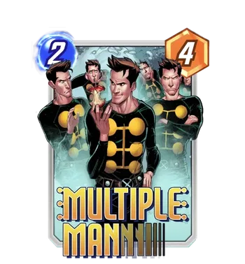
Original Cover: Marvel Snap Commission!
Artist: Combo Break
Colors: Ryan Kinnaird
If you thought 2nd place sounded harsh, I’ve got unfortunate news for you. Now, I do like a decent amount of Combo Break’s work on the base art— I think the base style for the game is necessary and competently carried out, and the stable of artists that Second Dinner works with for that style (which includes Eduardo Mello, Ryan Kinnaird, Combo Break, Eric Guerrero, Joverine, and more!) deserve praise for helping unify a recognizable and flexible look for the game.
But! Ryan Kinnaird’s coloring is markedly less interesting than Combo Break’s other color work, which does the piece no favors. And once again, regarding variants, that concession doesn’t hold up the same way for me. Having ‘skins’ done in the house style makes sense for lots of games, but for Marvel Snap, where Second Dinner can draw on incredible existing pieces from the source material, those ‘costume’ variants feel a lot less interesting and fun to me. This Multiple Man variant gets points for using the outfit Jamie wears in his defining X-Factor run where leads the titular detective agency— the simple long-sleeve is a good look for someone who’s always been a bit of an eyesore in traditional tights. (Again, the classic costume just isn’t it.) But there’s not enough context to help make the piece make sense. What’s with the apple? Is the idea that the front Madrox ate it all, to the rest of their chagrin? Did they all take a bite? There’s not enough context, so the faces feel nonsensical, and while part of Madrox’s schtick is that each dupe is a different aspect of his personality, it feels arbitrary here.
Part 2: Now Three More That Aren’t Here Yet
X-Corp
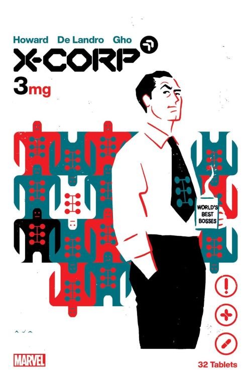
Original Cover: X-Corp (2021) #3
Artist: David Aja
Second Dinner: Please, please, please. I’m begging here, Johnny! This cover is from X-Corp, a short-lived series in the Krakoan era from a couple of years ago that starred, among others, our very own Jamie Madrox, newly appointed as a head scientist for the titular X-Corp. David Aja brings so much style to this piece, drawing on the vintage mod-retro look of 60’s advertising, with a striking limited color palette and a terrific use of white space to paint us a picture of the World’s Best Bosses. The background calls forward Jamie’s original strange, awkward costume, but turns it into a wallpaper— with a cool, collected office manager in front, logo emblazoned on the tie. Combined with the medical text elements (X-Corp was centered on Krakoa’s pharmaceutical trade), the piece is just cohesive and gorgeous— and it would make for, hands down, the most unique, striking variant for Jamie and even for Snap.
X-Corp, Again
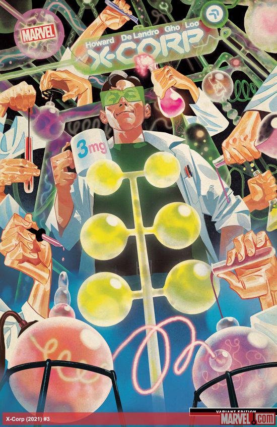
Original Cover: X-Corp (2021) #3 (Variant)
Artist: Mike Del Mundo
Now, isn’t this just on brand? Here’s another cover for the same issue that is, once again, I think, a top pick for a Jamie Madrox variant— drawn by none other than one of my favorite comic artists ever, that genius I rave about every chance I get, Mike Del Mundo!
Once more, we’ve got Jamie Madrox in a refreshingly clear and specific role— and where Aja leaned into the Corp in X-Corp, Del Mundo tackles the wild premise of Jamie as head scientist with an appropriately manic composition. One thing I adore about this piece is the breakaway from ‘multiple bodies doing stuff’ to represent Jamie’s powers— it’s the common, obvious way to depict them, and it makes sense. Still, Del Mundo’s use of just additional arms and hands streamlines the idea and makes it feel fun and new again. The incorporation of Jamie’s logo into the distillation flask front and center is the cherry on top. Combined with the lush and vibrant painted colors, all these elements would look brain-boggling in Snap’s cut-out, layered 3D— get our Madrox out of those tired, flat compositions and let the man cook!
Jamie Gets Thrown Out A Window
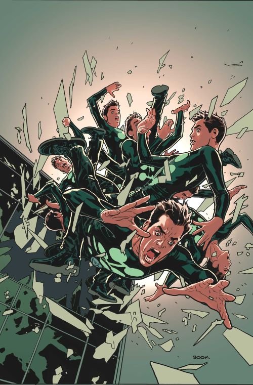
Original Cover: X-Factor (2005) #7
Artist: Ryan Sook
This, I think, is one of the more circulated covers for Multiple Man, dating back to 2006 in what’s arguably Jamie’s most influential period with Peter David’s noirish X-Factor. And for good reason— it’s Jamie at his visual best, taking advantage of the dynamism of multiple figures without letting it bog down the composition. The tangle of limbs and expressions at different angles elevates this above existing Madrox variants that feel more static and flat, and the inherent visual chaos of a defenestration (look it up!) makes this an incredibly kinetic piece, and one that would also shine converted through Snap’s 3D process. Imagine the layered foreground, all that debris— it’d pop so well! And if you want a proper X-Factor shout and a classic Jamie scene without any frills or extra gimmicks, there aren’t many better options than this.
Part 3: Honorable Mentions:
Even More Multiple Men
Original Covers: Multiple Man (2018) #1 and #5
Artist: Marcos Martín
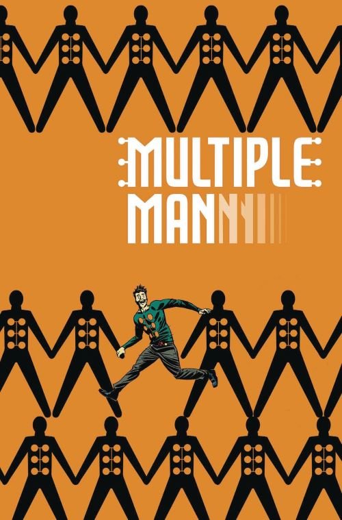
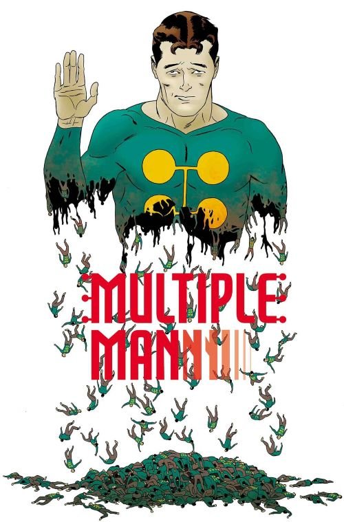
Whoops, looks like some dupes have gotten loose! (Code for, I lied, I just needed to include more.) I wanted to include this honorable mention to give a nod to yet another favorite comic artist of mine— Marcos Martín, who’s consistently a composition rockstar on both cover and interiors. Here, he’s done a series of fun covers for the Multiple Man miniseries Matthew Rosenberg wrote a while back— and while they’re all really sweet covers, I’m not positive they all fit the parameters for a Snap card focused on spotlighting the main character. Here I’ve got the covers for issues 1 and 5— the latter, I think, is more readily suited to a Snap card, with the fun, bittersweet premise of Jamie bidding the reader farewell as he dissolves away… into more Jamie.
Issue #1, on the other hand, I don’t think quite works for a Snap card… as is. It’s the most evocative of the covers in the series, with an impish Jamie symbolically breaking free from familiar patterns and iconography. The cover is composed to accommodate title text, ironically making it awkward to convert to Snap’s template with the card name at the bottom. But! The repeating Multiple Men icons are intentionally uniform— and hypothetically, if Second Dinner and/or Martín are amenable to an edit to accommodate Snap templating, I can see a Snap version of this cover that instead fills that space with another row of Multiple Men, leaving the one Jamie still gleefully running along. Second Dinner already edits existing covers to convert them to their 3D, and while this seems like a bit more work, the graphic, wallpaper-like nature of the cover makes it doable. The composition is irregular, with a small ‘main’ figure and more editing involved— but it's fitting for Madrox. And is it worth it? It’s Marcos Martín— it always is.
But That’s Just My Opinion
But that’s just my opinion, echo, echo, etc. If I was hard on a variant you enjoy or hyped up something you don’t like so much, that’s fair! Art is subjective, and I’m just one dude writing about it on a fan site for a Marvel card game. For now, I’m more than happy with Hipp’s Madrox in my collection, merging with the Phoenix and running amok.
And if you enjoyed this, or if you’ve got characters/cards you’d like to see featured in another— let me know below! I hope to make this a regular series because I love talking variants. I adore talking comic art, ranking both existing variants, and dreaming about variants that could be just the best of both worlds.
(I promise, I like more than 1 existing variant for most characters in this game.)