

Less is More!
As we enter the second week of the Guardians of the Galaxy Volume 2 Season, we have fewer variants to enjoy.
However, less doesn't mean less in quality because these variants are bangers. We got a lot of 4's, 4 and a half's, and yes, we do have a 5.
Grab your favorite beverage, sit back, relax, and enjoy the amazing art this week!
02/10
Drax: The Galactic Garden Party!
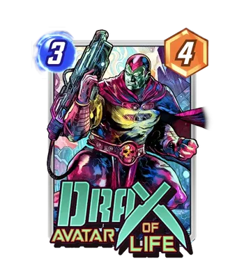
Artist: Vincenzo Riccardi
Source: Conditional Bundle
Rating: 4
Vincenzo Riccardi is here to convince you that Drax has a part-time job as a cosmic florist. This "Avatar of Life" variant is a vibrant departure from the usual "angry grey man with knives" look we see in the movies.
The first thing that hits you is the color palette. Riccardi isn't shy with the neon pinks, cyans, and deep purples. It looks less like a battlefield and more like Drax wandered into a high-end laser tag arena or a very aggressive botanical garden. The detail on the suit is fantastic, swapping out his usual bare chest for some sleek, high-tech armor that actually looks like it could protect him from something other than a light breeze.
Let's talk about that gun. It is massive, detailed, and looks like it weighs more than Rocket Raccoon's entire ego. The way the energy hose connects to his belt gives the card a great sense of "locked and loaded" utility. Riccardi's linework is sharp and energetic, making Drax feel like he is physically pulsing with the life force he is supposed to be representing. He looks focused, intense, and honestly, a little confused about why he is wearing so much pink.
The Perfect Split: Since this card is already a neon fever dream, you have to lean into it. A Purple Neon Border is the premier choice here. It would catch the highlights on his cape and the glow of the "Drax" logo perfectly. If you are feeling particularly spicy, an Ink Finish with a Magenta Kirby Krackle would be the ultimate flex. It would make the character pop against a gritty background while keeping that signature "Avatar of Life" energy alive and well.
Surge: High Voltage Heroine!
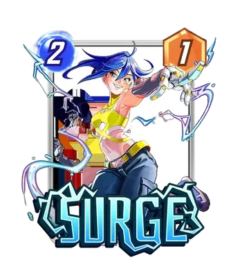
Artist: Envar Studio
Source: Super Rare
Rating: 4
This Surge variant is a literal breath of fresh air from the "I haven't slept in three weeks" gritty look that mutants often sport. Envar Studio has captured Noriko Ashida in a moment of pure, unadulterated confidence. She isn't just using her powers; she's showing off for the camera, and honestly, with that much electric style, who can blame her?
The linework here is incredibly clean, and the cel-shaded aesthetic makes the character pop in a way that feels modern and sharp. I love the way her signature blue hair is whipping around, mirroring the jagged arcs of electricity jumping off her gauntlets. Speaking of those gauntlets, the detail on the mechanical plating is fantastic, giving a nice industrial weight to an otherwise light and airy composition. The bright yellow top is a bold choice that contrasts beautifully with the blue energy trails, making sure your opponent sees her coming from a mile away.
It's a high-energy, playful take on the character that balances her heavy-duty powers with a lighthearted vibe. She looks like she's about to dash across the board, mess up your opponent's curve, and be back in time for lunch.
The Perfect Split: To really lean into that "High Voltage" aesthetic, you should aim for a Blue Neon Border. It would highlight the electricity crackling around her fingers and tie the blue of her hair and the logo together in a way that feels totally cohesive. If you want to go for the ultimate "Electric God" look, a Gold Finish with a Blue Kirby Krackle would make it look like Surge is literally vibrating with enough power to jump start a Helicarrier.
High Evolutionary: Cosmic Perfection
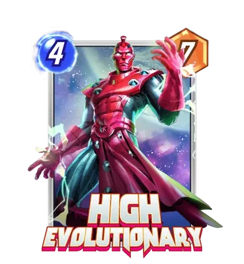
Artist: Grafit Studio
Source: Super Rare
Rating: 3.5
Grafit Studio is here to remind you that High Evolutionary is the pinnacle of genetic engineering. This variant is a masterclass in scale and presence, capturing Herbert Wyndham in a pose that screams, "I just rewrote your DNA, and I didn't even use a pencil."
The first thing that grabs you is the lighting. The way the cosmic energy reflects off his crimson armor is stunning, giving the entire piece a cinematic, high-stakes feel. Grafit Studio has a gift for texture, and you can practically feel the cold, metallic surface of his suit against the swirling, nebulous background. His expression is one of calm, detached authority, which is exactly how you want to feel when you're dropping a 20 power Hulk on the final turn.
The energy effects are subtle but effective, with small arcs of electricity dancing around his hands, signaling that he is constantly in the process of creating (or destroying) life. The deep purples and blues of the background provide a perfect contrast to his bright red silhouette, making him the undisputed center of the universe.
The Perfect Split: Since this card is all about cosmic authority, a White Neon Border is the only way to go. It would frame the character beautifully and highlight the glowing white of his eyes, making the whole design feel sleek and modern. If you really want to lean into his "Omega Level" status, a Gold Finish with a White Krackle would turn this into a legendary artifact that looks pulled straight from the heart of a dying star.
Spider-Punk: Anarchy in the SNAP!
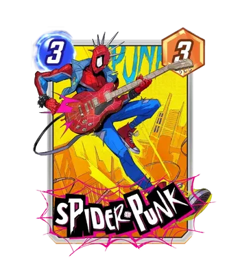
Artist: Hicham Habchi
Source: Bundle - The New Punk Rock
Rating: 4.5
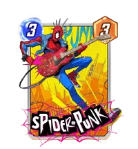
Hicham Habchi has officially dropped the mic. This Spider-Punk variant isn't just a card; it's a high-voltage rebellion captured in ink and neon. Released as part of "The New Punk Rock" bundle on February 10, 2026, it perfectly encapsulates Hobie Brown's "fight with rhythm and heart".
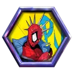
The composition is pure kinetic energy. You've got Hobie mid-shred on a web-patterned guitar that looks like it could knock back a zombified Galactus with a single chord. Habchi's signature style brings a sharp, "street-art" edge to the Spider-Verse, with those aggressive spikes on the mask and the vibrant yellow cityscape background providing a killer contrast to the deep blues and reds of the suit. The way the webbing entangles the "SPIDER-PUNK" logo at the bottom adds that extra layer of depth that makes it feel like it's breaking through the screen.
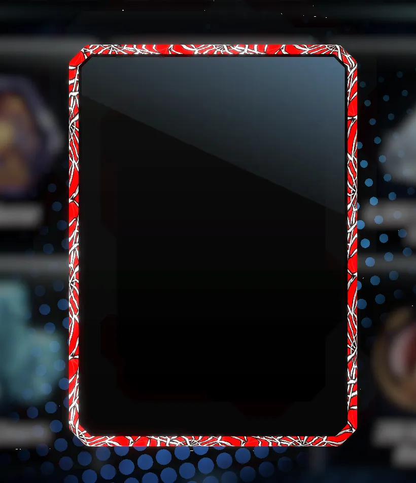
The Perfect Split: You honestly can't skip the WebRed Border that comes in the bundle; it was tailor-made for the red accents on his guitar and boots. If you want to go full mosh pit, aim for an Ink Finish with a Magenta Kirby Krackle. It'll turn the background into a gritty underground gig while making the neon pink guitar sparks look like they're actually vibrating.

02/11
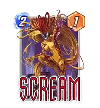
Scream: Lethal High Notes
Artist: Joshua Rodriguez
Source: Bundle - Loud and Lethal
Rating: 4.5
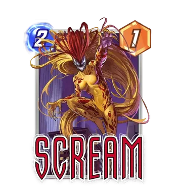
Nothing screams, "I'm about to ruin your movement deck," quite like this Joshua Rodriguez Scream variant. This variant is a visceral masterpiece that captures the pure, chaotic energy of the Scream symbiote. Released as the centerpiece of the "Loud and Lethal" bundle for 4000 Gold, it is a high-stakes addition for any collector who enjoys a side of horror with their card games.
The composition is stunning. You have Scream mid-leap, hair flowing like a mass of golden, living tentacles. Rodriguez's use of deep reds and blacks against that muted purple background makes the character look like she is physically lunging out of the frame. It is a much more aggressive take on her than the standard art, leaning into the "lethal" part of her name.
The Perfect Split: Since the bundle includes 5500 Credits, you should have plenty of juice to hunt for a split. A Red Neon Border is the premier choice here, as it matches the blood-red tones of the symbiote perfectly. If you want to get really wild, an Ink Finish with a Black Kirby Krackle would turn this into a gritty, classic comic panel that highlights Rodriguez's incredible linework.

Gorr: The Shadow of the Butcher
Artist: Envar Studio
Source: Super Rare
Rating: 4.5
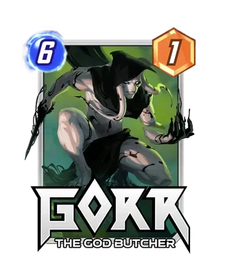
This Gorr variant makes your opponent feel like a literal ghost is hunting them. The new Envare Studio variant of Gorr is a masterclass in atmospheric storytelling, capturing the God Butcher in a low, predatory crouch that suggests he is about to end someone's legendary career.
The lighting here is phenomenal. The way the soft, swampy green background contrasts with the stark grey of Gorr's skin and the deep blacks of the All-Black Necrosword is pure cinematic perfection. Envar Studio has a knack for making characters feel grounded yet supernatural, and the subtle black energy licking off his hands makes the card feel alive even before you see the animation. He looks less like a comic book villain and more like a nightmare from a high-end dark fantasy anime.
The Perfect Split: To lean into that eerie, mystical vibe, a Green Neon Border is the only correct answer. It would perfectly highlight the background mist and the glow of his eyes. If you want to go full "horror movie," an Ink Finish with a Black Krackle would make Gorr look like a shadowy figure stepping out of an ancient, forbidden scroll.
02/12
Silver Surfer First Steps: The Empress of the Void
Artist: Creative House Pocket
Source: Super Rare
Rating: 5
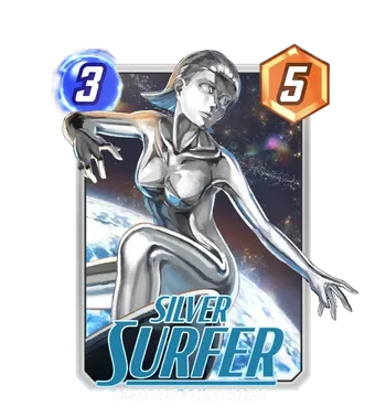
If you thought Norrin Radd was the only one who could make a surfboard look like a high-fashion accessory, Creative House Pocket is here to introduce you to Shalla Bal. This variant, inspired by the Fantastic Four: First Steps look, is a gorgeous, sleek departure from the traditional Surfer. It captures the Herald of Galactus in a moment of cosmic serenity, drifting through a nebula that looks painted with stardust and expensive watercolors.
The art style is typical of Creative House Pocket: clean, vibrant, and packed with personality. The metallic sheen on Shalla Bal is fantastic, catching the light of distant planets in a way that makes the card feel truly "Super Rare".
The Perfect Split: Since this variant is all about that celestial glow, a Blue Neon Border is the premier choice. It would perfectly frame the nebula in the background and highlight the arcs of cosmic energy around her. If you want to go for a "First Step into the Void" look, an Ink Finish with a White Kirby Krackle would make Shalla Bal look like a ghostly constellation drifting through deep space.
02/13
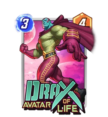
Drax: The Cosmic Crusader
Artist: Paul Mafayon
Source: Rare
Rating: 3
The art style of this Drax, Avatar of Life variant is smooth and vibrant, which is a signature of Paul Mafayon's work. The way the soft pink and purple nebulae in the background contrast with the lime green of Drax's skin is a great touch, making the character pop without needing a ton of jagged energy effects. The detail on his suit is surprisingly technical, with those gold "ladder" patterns along his sides giving him a sleek, aerodynamic look. He is a 3-cost, 4-power card that relies on your ability to predict your opponent's next move, and this art makes him look like he's already three steps ahead of the game.
It is a solid, clean variant that leans into the brighter side of the Marvel cosmic universe. While it might not have the raw, menacing energy of a Grafit or Envar piece, it has a certain old-school charm that makes it a great addition to any Guardians of the Galaxy-themed deck.
The Perfect Split: To lean into that vibrant, 80s space aesthetic, a Pink Neon Border is the premier choice here. It would perfectly match the background moons and the highlights on his cape, making the entire card feel like a cohesive piece of pop art. If you want to go for a more "legendary" feel, a Gold Finish with a Purple Flare would make the golden accents on his suit and gauntlets shimmer like he is literally glowing with the life force he represents.
02/14
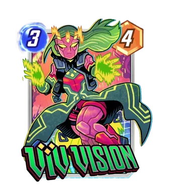
Viv Vision: Cyberpunk Synthezoid
Artist: Dan Hipp
Source: Bundle - Feb 26 Vis
Rating: 4.5
This new Viv Vision shows off Hipp's signature bold, flat colors and thick linework, turning Vision's daughter into a neon-clad rebel who looks like she's about to hack into your opponent's server.
The color theory here is wild. You have the vibrant magenta of her synthetic skin contrasting against that lime green hair and the electric yellow energy crackling from her hands. The "technical" details of her outfit, like the glowing circuits on her coat and the tactical vest, give the card a great "tech-wear" aesthetic that fits the cyberpunk theme perfectly. Even the background, with its digital grid and sunset hues, adds to the feeling that Viv is mid-dash through a high-tech cityscape.
The Perfect Split: Since this variant is already a neon fever dream, you have to lean into it. A Green Neon Border is the premier choice here, as it would perfectly frame the energy in her hands and match her hair. If you want to go for the ultimate arcade look, an Ink Finish with a Rainbow Kirby Krackle would make the character pop against a black-and-white digital void while keeping those colorful sparks flying around her.

02/15
Major Victory: The Guardian's Shield
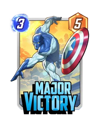
Artist: Paul Mafayon
Source: Rare
Rating: 3.5
My first reaction to this Major Victory variant is that it perfectly captures that "super soldier from the future" vibe without all the grimdark baggage. This Major Victory variant trades the gritty textures of modern comics for a clean, vibrant aesthetic that looks like it belongs on a Saturday morning cartoon intro. Vance Astro is captured mid-stride, his iconic shield raised and ready to deflect anything from a cosmic blast to your opponent's best insults.
The color palette is classic Mafayon—bright, bold, and perfectly balanced. The deep blues of Vance's suit pop beautifully against that warm, golden sunset background, giving the card a sense of hope and "major victory" (pardon the pun) before you even play it. The detail on the shield is fantastic, with the chrome-like finish reflecting the environment in a way that makes the card feel premium despite its "Rare" status.
In your deck, Major Victory is a 3-cost, 4-power card with an On Reveal ability that adds 2 members of the Guardians crew to your hand. He is essentially a 1-man recruitment office, perfect for refilling your hand in "Guardians" synergy decks or providing fuel for cards like The Collector. He might not be the flashiest meta-breaker, but he's a reliable soldier who ensures you never run out of options.
The Perfect Split: To lean into that clean, heroic aesthetic, a White Neon Border is the premier choice here. It would match the white stars and stripes on his shield and give the whole card a crisp, modern finish. If you want to go for a more "legendary" look, a Gold Finish with a Blue Flare would make the golden sky shimmer while highlighting the deep blue of his cosmic suit, turning Major Victory into a true beacon of leadership on your board.
Major Victory: Cosmic Shield of Justice
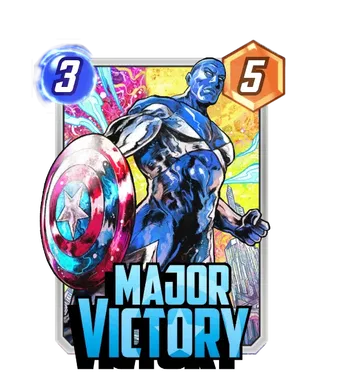
Artist: Vincenzo Riccardi
Source: Conditional Bundle
Rating: 4
This Vincenzo Riccardi variant is a visual feast that feels like a classic comic book cover was hit with a dose of pure psychedelic energy.
The first thing that grabs you is the use of color. We have this deep, metallic blue on Major Victory's suit that contrasts beautifully with the chaotic, swirling pinks and yellows of the background. It looks like he's standing right in the middle of a Kirby Krackle explosion, which is very on brand for a guy who spent a thousand years in a refrigerator to save the galaxy.
The shield is the real MVP here. Riccardi gives it this weathered, chrome texture that reflects the cosmic madness around it. You can practically feel the weight of it as Vance leans into the frame, looking like he's ready to punch a hole through the multiverse. It's aggressive, it's vibrant, and it has that "Final Boss" aesthetic we saw in some of the bigger dragon variants earlier this month.
The Perfect Split: To really make this card transcend reality, you have to go for a Blue Neon Border. It would tie into his suit and the energy crackling around his fist, making the whole design feel incredibly cohesive. If you want to get really wild, an Ink Finish with a Magenta Flare would be the ultimate flex. It would turn the background into a moody, high contrast dreamscape while keeping that pop of chaos magic color that makes Riccardi's work so distinct.
Armor: Unbreakable Spirit
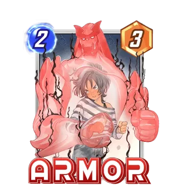
Artist: Peach Momoko
Source: Bundle - Unbreakable Spirit
Rating: 4.5
This Armor variant was released on February 3rd, 2026, for a very reasonable $9.99, and it trades the high-tech mechanical suits for a more ethereal, spiritual energy that is frankly a breath of fresh air.
The composition is classic Momoko: soft, watercolor textures mixed with sharp, intentional linework. I love how Hisako is centered, looking focused and calm while her psionic armor manifests behind her like a guardian deity. The use of muted pinks and greys gives the card a sophisticated, high-end feel that makes most other variants look like they are trying way too hard. She is a Series 1 staple, but this art makes her feel like a Series 5 trophy.
Mechanically, she remains the ultimate insurance policy. As a 2-cost, 3-power card, her Ongoing ability prevents any cards at her location from being destroyed. Whether you are protecting your own big hitters from Shang-Chi or ruining a Destroy player's entire weekend, Armor does it with a grace that this variant captures perfectly.
The Perfect Split: The bundle actually comes with a MatteBlack Border, which is a surprisingly classy choice that grounds the airy art style perfectly. If you are looking to take it to the next level, an Ink Finish with a White Kirby Krackle would be breathtaking. It would turn the variant into a piece of traditional Japanese ink art while keeping that "unbreakable" energy pulsing around the edges.

THE WRAP-UP
BANG BANG! Wow, yeah, these variants are pretty cool! Vincent Riccardi again comes through with some amazing variants. We also have two new cards this week!
Super excited for these variants, and let's not forget that Silver Surfer First Steps! Yes, the armor variant was already released a week prior, but the way the data mines work, we get some of this data with different dates at different times.
Let me know which variant deserves your 5 this week, and we'll catch you in the next one!