
The Weapon X Season Launch: Art, Arcade Classics & More!
The weather outside is getting frightful, but the variants this month are absolutely delightful! Grab your hot cocoa and settle in because the Weapon X season is almost here, and it is bringing the heat to melt all that snow.
New season = New Season Pass Giveaway! Find out how to enter :)
Starting December 2, we are diving deep into the dark, gritty history of the Weapon X program.
12/02
Weapon X Program!
Artist: Supja
Source: Season Pass
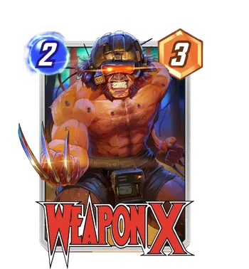
Finally, we have the star of the show. This Weapon X Wolverine variant is the Level 50 reward for the Season Pass, and it is for the brand new card, Weapon X Wolverine! This is Logan at his most vulnerable and his most dangerous. The Weapon X helmet, the wires, the raw muscle on display... it tells the tragic story of his origin in a single image.
The lighting here is what sells it for me. The way the red light from the visor glows and reflects off his skin is masterful. It makes him look more like a machine than a man, which is precisely what the Weapon X program wanted. The composition is tight and focused, putting all the emphasis on his pain and his rage.
This card deserves a Red Krackle split to match that menacing visor glow. It would make the card look like it is surging with unstable energy—a truly spectacular variant for a brand new card.
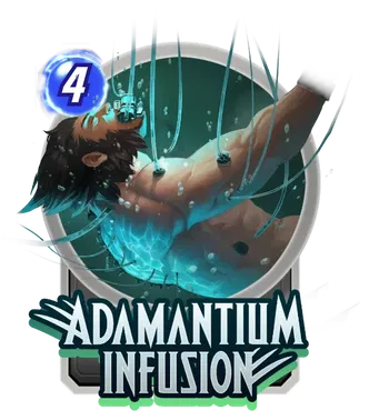
This design shows Wolverine suspended in the Weapon X tank, surrounded by bubbles and green liquid. It is a cool, thematic nod to the experiments that created him. It matches the season theme perfectly and looks great on the board!
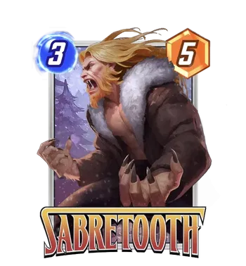
Now, Victor Creed himself, Sabretooth! This variant is arguably one of the best fits for a December release we have ever seen. Seeing Sabretooth decked out in that thick, fur-lined winter coat feels right. It gives him this rugged, survivalist look that fits his lore as a tracker in the Canadian wilderness perfectly.
The expression here is pure rage. Sabretooth is not posing; he's hunting. The way the snow is falling around him adds such a great atmosphere to the card. It feels cold, harsh, and dangerous. The lighting on his face and the detail in the fur texture are top-notch. Supja really nailed the "wild animal" vibe here.
For the perfect split, a Gold finish would look incredible. It would make the warm tones of his coat and hair pop against the background. A White Krackle would be the dream, mimicking the snowstorm he is fighting through.
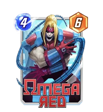
Next up, we have the deadly Omega Red. This card is terrifying in the best way possible. Supja has captured Arkady in a moment of pure, unleashed chaos. The perspective here is fantastic, with those carbonadium tentacles whipping out towards the viewer, making you feel like you are next on his list.
The colors are stunning. The bright red of Omega Red's armor contrasts so well with the cool blue energy and the snowy background. It creates this vibrant clash that draws your eye immediately to his screaming face. You can feel the weight and the momentum of the character. It is visceral and intense.
I would aim for an Inked split on this one. The high contrast between the darks of his suit and the bright energy effects would look striking in black and white. If you want to keep the color, a Red Border is a must to match that iconic armor.
Supja Brings the Heat
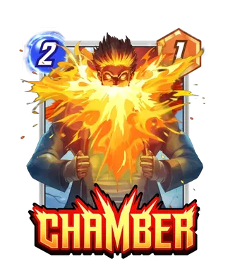
When you thought the Supja takeover was finished with the Season Pass, we get this absolute heater for Chamber. Supja is quickly becoming a favorite for the X Men heavy hitters this month.
Artist: SUPJA
Source: Unknown
Talk about heartburn, right? Okay, sorry, I had to do it. But seriously, this variant is explosive. Supja has this incredible way of rendering energy that makes it look thick and viscous, almost like liquid magma rather than just light.
The composition is simple but effective. Chamber is dead center, pulling his jacket open like Superman, but instead of an "S" logo, you get a nuclear blast of psionic energy. The expression in his eyes is intense, showing pure, white hot power. The contrast between the cool blue background and the fiery orange center makes the character pop right off the frame.
For the split, you want to keep that heat going. A Gold finish is the way to go here. It will blend perfectly with the explosion. If you can snag an Orange Krackle, you are winning. Pair it with an Orange Border or a Red Border.
X-23 The All-New Wolverine & NEW Artist
Artist: Anand Ramcheron
Source: Super Rare Pool
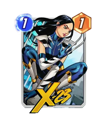
X-23 is fully embracing the mantle of Wolverine, looking composed, lethal, and ready to drop in on a lane near you.
The coloring is fantastic here. The deep blues of the suit contrast really well with the bright yellow accents on X-23's boots and gloves. It is a much more heroic look compared to some of her more feral variants.
For the split, a Gold Finish is the absolute dream here. It would pick up the gold in her armor perfectly and make the whole card feel regal. Pair that with a Blue Border to match the suit, and you have one of the cleanest X-23 cards in the game.
Wolverine Hart: The BEST THERE IS..
Artist: Viktor Farro
Source: Best There Is Bundle
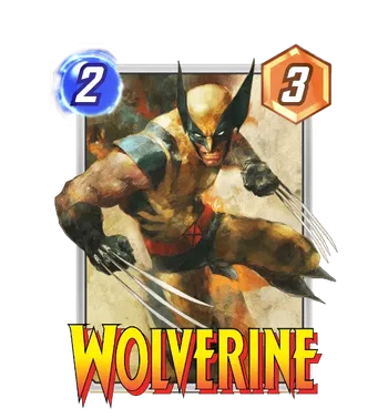
Viktor Farro does not miss. His style is becoming one of the most recognizable in the game because of how raw and imposing he makes these characters feel. This Wolverine variant is a perfect example of that "mixed media" look he excels at. It feels like a high-quality concept art piece straight out of a movie production.
The texture work here is incredible. It's not just flat colors; you can see the grit in the suit and the motion blur on the claws that gives it a serious sense of speed. He looks stocky, dangerous, and entirely ready to shred whatever lane he lands in. It captures that classic "berserker rage" vibe perfectly without needing over-the-top effects.
For the split, I recommend aiming for a Gold Finish. The warm, earthy tones of the background and his suit would blend seamlessly with a gold finish. Throw on a Red Border to match the "Wolverine" logo and the X-Men belt buckle, and you have a top-tier variant for one of the most reliable destroy cards in the game.
Deadpool: Better Than The Best There Is!
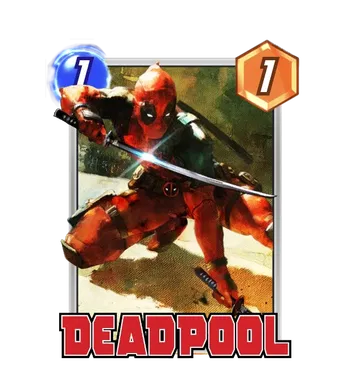
Artist: Viktor Farro
Source: Better Than Wolverine Bundle
If you thought the Viktor Farro Wolverine was gritty, wait until you see this. This variant is arguably the most "Deadpool" piece of art we have in the game that isn't just a meme. It captures the lethal mercenary side of the character that often gets overshadowed by the comedy.
The composition is fantastic. The low angle makes him look ready to spring forward, and the way the light catches the blade of his katana is pure cinematic perfection. Farro's signature texture work is all over this; the suit looks worn and battle-damaged, and the blood splatter effects on the ground add a visceral touch that fits the Destroy archetype perfectly.
For the split, I'm looking at an Inked Finish with a Red Krackle. The black and white would make the blood and the suit's texture look even more intense, like a panel from a noir comic book. It's a serious upgrade for anyone who loves the Merc with a Mouth.
Love, Death, Symbiotes Bundle
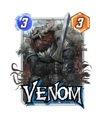
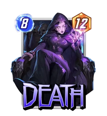
They say love hurts, but in Marvel Snap, it usually just destroys your cards to feed a giant symbiote. We are getting a very spicy bundle dropping this week titled "Love, Death, Symbiotes." If you are a fan of Destroy decks (and let's be real, who isn't right now?), this is a massive cosmetic upgrade for two of the archetype's biggest staples.
Artist: Derrick Chew
Source: Love, Death, Symbiotes Bundle
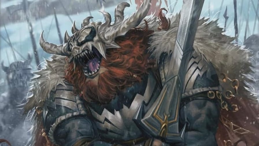
I am obsessed with "Viking Venom". The design is wild! He's got the fur cloak, the leather straps, and a sword that looks like it weighs more than a small car. It gives off serious Conan the Barbarian meets Elden Ring energy. The detail on the helmet, where the symbiote is forming horns, is such a cool touch. It makes him look like a warlord from a heavy metal album cover.
For the split, you have to go INK. It would lean into that "Legendary Warrior" vibe perfectly. Pair it with a Red Border to match the blood-red beard and the aggression of the card. It is a total showstopper.
Artist: Tae Kwon Kim
Source: Love, Death, Symbiotes Bundle
And then there is the Queen herself. Tae Kwon Kim has delivered what might be the definitive "Goth Mommy" Death variant. I don't make the rules; I enforce them.
She is sitting on a throne, looking completely unbothered, with a casual hand gesture that says, "Yes, I am Death, what about it?" The lighting is moody and atmospheric, with those deep purples and shadows framing her pale face. The glowing white eyes are piercing. It is regal, elegant, and intimidating all at once.
This card is begging for a Purple Border. Do not overthink it. The purple border matches her magic and her outfit perfectly. If you get an Inked Split, it would look like a charcoal drawing of a Gothic cathedral, absolutely haunting and beautiful.
Getting the Band Back Together!
You didn't think Brett Bean was done with the musical mayhem, did you? After seeing Chameleon and Hydro-Man shredding it up last week, we now have the rhythm section and the frontman to complete the lineup. These variants are loud, chaotic, and absolutely perfect for anyone who wants their deck to have some serious attitude.
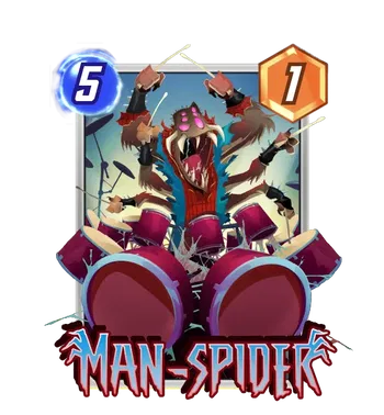
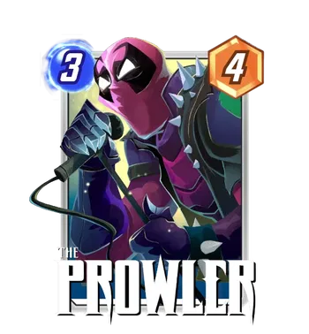
Artist: Brett Bean
Source: Rare Pool
If you need a drummer, you get the guy with six arms. It's just common sense. Brett Bean has turned Man-Spider into the ultimate percussionist here, and I am absolutely here for it.
This variant gives off major "Animal" from The Muppets energy, just pure, unbridled chaos. Since Man-Spider's ability is all about merging and doubling power, seeing him in a frenzy, smashing a drum kit, feels incredibly appropriate. He looks like he is playing a solo that is about to bring the entire venue down. The tattered Spidey suit and the wild, open-mouthed scream add so much character.
For the split, you need something loud. A Neon Border would look fantastic, playing off the "mutated" vibe of the character. If you want to lean into the concert aesthetic, a Gold background would make it look like he is under the stage lights.
And fronting the band, we have The Prowler! Aaron Davis has traded his stealth suit for a spiked leather vest and a microphone, and he looks ready to scream.
This design is so much fun. The bright pink mask contrasts perfectly with the dark purple and black of his punk-rock outfit. The way he is gripping the mic stand with those clawed gauntlets, which look suspiciously like his "Thief's Tools," is a great detail. It's gritty, colorful, and full of personality. He isn't just stealing tech anymore; he's stealing the show.
Speaking of, I had the honor to spotlight this card and have a video on the Marvel SNAP YouTube channel - go check it out, AFTER you finish reading this article, of course :)
This card is begging for a Neon Purple. It would match his mask and the overall color palette flawlessly. An Inked Split would also go hard here, making it look like a photocopy of a punk show flyer.
Token Shop Takeover: Fantasy Class!
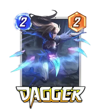
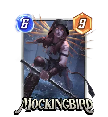
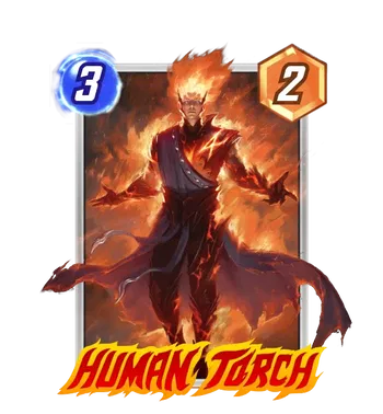
Artist: DIVE Eight Studio
Source: Token Shop (Fantasy Variant)
We are seeing the release of three incredible Fantasy Variants for Dagger, Mockingbird, and Human Torch. If you are a fan of Dungeons & Dragons or love that RPG aesthetic, your tokens are in grave danger this week.
This Fantasy Dagger variant is sleek, deadly, and absolutely magical.
The lighting here is the standout feature. The way the blue psionic daggers glow against the dark, moody background gives the card a mysterious, assassin-like vibe. Her outfit looks like enchanted leather armor, perfect for high-speed movement and critical hits. The motion in her hair and the floating daggers make it feel like she is mid-strike, blinking out of the shadows to clear a lane.
For the split, you have to go with a Blue Neon Border. It matches her light daggers perfectly. If you can get a Blue Krackle on a Black and White background, it would look like she is striking from the darkness.
Next up, we have Mockingbird, who looks like she multiclassed into Paladin. This is easily one of the most majestic variants Bobbi has ever received.
The wings are the first thing you notice. Giant, golden energy wings that frame Mockingbird perfectly. She is wielding a staff that looks less like a baton and more like a holy relic. The glowing orange eyes add a supernatural element, making her look like a divine avenger rather than a S.H.I.E.L.D. agent. It's powerful, regal, and commands attention on the board.
This card is begging for a Gold Border. It would complement the wings and the warm lighting of the art beautifully. A Gold background would turn this into a literal golden angel.
Finally, we have the Human Torch, reimagined as a Pyromancer Supreme. Forget the sci-fi suit; Johnny Storm is rocking full mage robes that are actively burning away into ash and fire.
This variant is a fantastic take on the character. It leans into the "elemental" side of Torch's powers, making him look like a sorcerer casting a massive fireball. The "4" sigil burning on his chest is a great detail that keeps him grounded in the Fantastic Four lore while fitting the fantasy theme. The colors are rich and warm, with deep reds and oranges that look like liquid magma.
I recommend an Orange Border or a Red Border to match the intensity of the flames.
Conquest Shop: The Mind Games Begin!
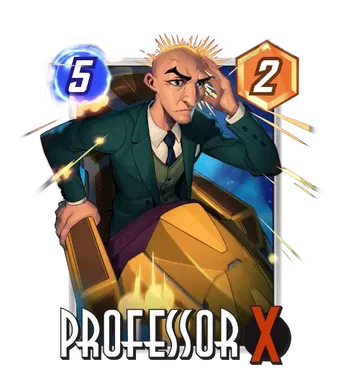
Artist: Mooncolony
Source: Conquest Shop
Mooncolony has been crushing it lately with these stylized, animated looks, and this Professor X is no exception. This variant doesn't portray a calm, diplomatic Charles we sometimes see; this is "battle mode" Xavier.
The first thing that grabs you is the expression: the furrowed brow and the intense focus. Charles is locking down a lane with his mind right now. The "telepathic burst" lines radiating from his head are a great comic book touch that adds immediate action to the card. And let's talk about the hoverchair! That bulky, yellow gold design is straight out of the '90s animated series era, and it looks fantastic in this art style.
For the split, this one is easy. A Blue Krackle to represent his psychic waves, and you have a variant that demands respect.
12/03
Pandart Studio Takeover!
Artist: PANDART STUDIO
Source: Super Rare Pool
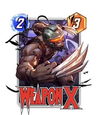
Fresh off his debut in the Season Pass, Weapon X is already getting the Pandart treatment. This variant leans heavily into the "living weapon" aesthetic. The helmet is sleek, the visor is glowing with that signature menacing red, and the cables flailing around him add so much motion to the piece.
What I love about Pandart is how they handle musculature. They make him look absolutely massive, but with a digital polish that makes it feel like a frame from a high-budget anime. The claws look razor sharp, and the "WEAPON X" logo integrated into the bottom is a nice touch that frames the art perfectly.
For the split, you want an Ink Split. It would match the metal of the helmet and the claws. Throw on a Red Krackle to match the visor, and you have a terrifying machine of destruction.
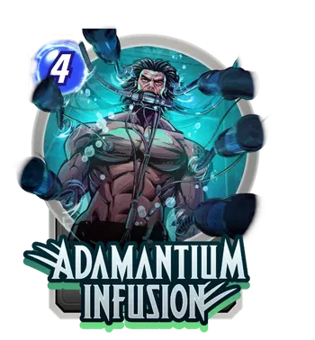
Adamantium Infusion is also getting a Pandart LOVE! This art captures the horrific process of bonding the metal to the bone, but makes it look strangely beautiful.
The teal and blue lighting in the tank is stunning. The bubbles and the tubes create a sense of claustrophobia, but the expression on the face is pure determination (and maybe a little bit of agony). It is a very "sci-fi horror" look that stands out on the board.
I suggest an Inked Split for this one. It would make it look like a classified blueprint or a medical scan. If you keep the color, a Green Border or Blue Border is essential to match the liquid in the tank.
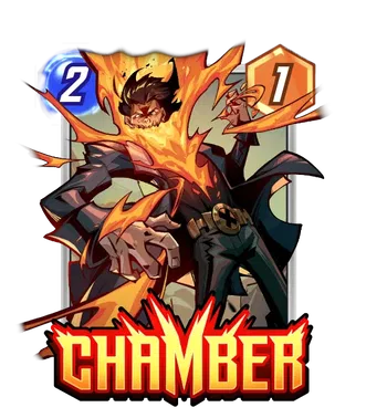
Finally, we have Chamber. If you thought his base art was cool, wait until you see this. Pandart has turned the psionic energy burst into a masterpiece.
The way the energy rips out of his chest and forms that jagged, explosive shape is incredible. The contrast between the bright yellow-orange fire and the dark, cool tones of his jacket and the background is top-tier color theory. He looks powerful, volatile, and effortless all at the same time.
A Gold Finish is the only correct answer here. It will make that energy blast look like it is literally glowing off the screen. Pair it with an Orange Border to complete the look.
12/04
Breaking Glass (And My Wallet)
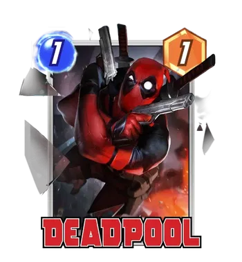
Artist: PANDART STUDIO
Source: Super Rare Pool
This Deadpool variant is the classic "diving backwards while shooting two guns" pose that John Woo invented and Deadpool perfected. It is pure action movie chaos. The shattered glass flying everywhere is the real MVP of this composition as it adds so much texture and depth to the image. It freezes the moment perfectly, making you feel like you are watching a slow-motion scene in the cinema.
As always with Pandart, the lighting is impeccable. The sheen on the red leather of his suit makes it look expensive, and the reflections on the gun barrels are razor sharp. It's polished, it's high-energy, and it's precisely the showboating Wade Wilson lives for.
For the split, I recommend something a little different. Go for a Prism Finish. I know, I know, Prism is usually the "we have Gold at home" split, but hear me out: the geometric patterns of the Prism background will actually complement the shattered glass shards really well. Pair it with a Red Border or a White Border to match the debris, and you have a very unique-looking card.
Great Responsibility Bundle
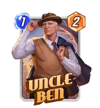
Artist: Envar Studio
Source: Great Responsibility Bundle
Look at this absolute gentleman. Envar Studio has given us an Uncle Ben that feels quintessential. He is dapper, he is warm, and he is giving us that classic hat tip that says, "I'm proud of you, kid."
The setting is perfect. A crisp autumn day that matches the earthy tones of his vest and that jacket slung effortlessly over his shoulder. It gives the whole card a nostalgic, "Golden Age" Americana vibe. Unlike the chaos of the Symbiotes or the tech of the Spiders, this art is grounded and peaceful. It is a reminder of the humanity behind the mask.
For the split, you have to treat this with respect. A Gold or Orange Cosmic Border, if you want to keep it looking vintage.
12/05
Tribute Games Champion Variants
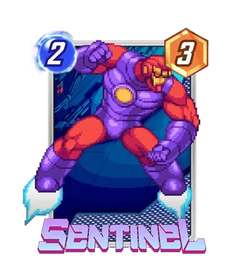
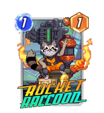
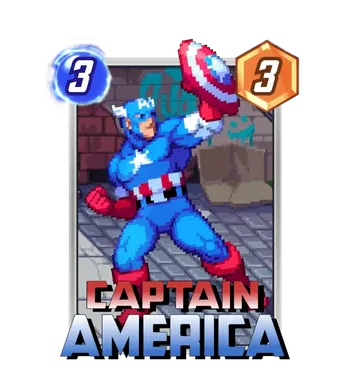
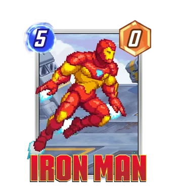
Okay, put down your pitchforks. I know the word "Pixel" usually triggers a fight or flight response in this community. But trust me when I say you need to look at these. Tribute Games, the absolute legends behind Teenage Mutant Ninja Turtles: Shredder's Revenge and Scott Pilgrim vs. The World: The Game, have entered the chat.
They have dropped a massive collection of "Champion Variants" that are completely rewriting the rules on what a pixel card can look like. These aren't your standard "standing awkwardly in a void" sprites. These are high-octane, arcade-ready masterpieces that look ripped straight out of a Capcom cabinet in 1996.
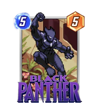
This Black Panther might be the most dynamic pixel variant we have ever seen. T'Challa isn't just posing; he is mid-pounce, claws out, ready to strike. The animation style here is flawless! You can feel the weight and the momentum behind the movement.
The background details are subtle but significant, hinting at Wakandan architecture or a jungle ruin. The way the light hits his suit, creating those classic purple highlights on the black vibranium, is a masterclass in pixel shading.
You have to go to Purple Border. It's the only choice. Pair it with a Gold Finish background to give it that royal Wakandan flair.
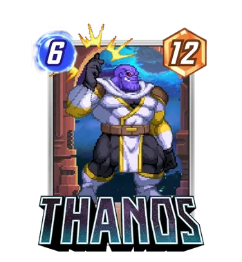
If you buy one pixel variant in your entire life, make it this one. Seeing the Mad Titan in glorious 16-bit detail, mid-Snap, is just too cool. The shading on the muscles and the Gauntlet is incredible, giving him a bulk and weight that pixel art often lacks.
The little "sparkle" effects around the snap are the cherry on top. It gives the card so much movement. When you play this, it doesn't feel like you are dropping a card; it feels like you are triggering a screen-clearing super move.
Go for Gold. It matches the Infinity Gauntlet and makes him look like a literal trophy.
Marvel vs. Capcom fans, our time has come. This Sentinel is pure nostalgia bait. The pose is dynamic, with the repulsor blast charging up and the boosters flaring at his feet. It captures that relentless, terrifying energy of the character perfectly.
The colors here are vibrant and distinct. The purple and pink tones pop beautifully against the blue background. It is a massive upgrade from the base pixel Sentinel, which... well, the less said about that, the better.
Inked with a Blue Krackle. It gives it that "cold, unfeeling machine" vibe.
Look at this little maniac. Rocket is sitting on a literal throne of guns and ammo, laughing his little raccoon head off. This variant's character work is at its finest. You can practically hear the 8-bit laughter sound effect just looking at it.
The detail on the weaponry is impressive, but it is the expression on Rocket's face that sells it. He looks like he is having the time of his life, blowing things up. It is chaotic, fun, and fits the card's ability perfectly.
Gold Finish again here. It makes the flames and the gold casing of the bullets shine even brighter.
And finally, we have Cap. This variant screams "classic beat-'em-up." He is winding up for a shield throw that looks like it is about to bounce off three goons and a vending machine.
The background is my favorite part; that gritty brick wall with the graffiti is such a specific aesthetic choice that perfectly captures the vibe of 90s street brawler games. It grounds the character and adds so much flavor to the card.
A Blue Border keeps it clean and classic. If you want to get fancy, a Red Krackle would look like the impact sparks from his shield hitting a target.
Marvel vs. Capcom fans, stand up! This Iron Man is giving me serious "Proton Cannon!" energy. He is flying forward, repulsors flaring, with that classic red and gold armor shining brightly.
What I love about this one is the sense of speed. The blue energy trails from his boots and gloves give the card so much forward momentum. It feels heroic and fast, a stark contrast to the usually static Iron Man variants we get.
Gold Finish is a must here. It blends perfectly with the armor. Throw on a Red Border to frame it, and you have a card that looks like a high-score trophy.
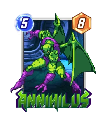
If you have ever played a side-scrolling shooter, you know exactly what this is. Annihilus is giving off that final boss energy that makes you lose all your quarters. Annihilus looks absolutely menacing here. The sprite work on his wings is incredibly detailed, giving them a jagged, insectoid texture that feels sharp even in 16-bit.
The Protagonist Has Arrived
Artist: SUPJA
Source: Unknown (Likely Spotlight/Event)
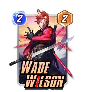
SUPJA has a gift for blending that high-gloss, rendered style with serious anime protagonist energy, and this variant is the peak of that aesthetic. This Wade Wilson isn't the "Merc with a Mouth" cracking jokes; this is Wade Wilson, the highly trained killer.
The unmasked look here is striking. Wade looks focused, lethal, and frankly, like he just stepped out of a Final Fantasy cutscene. The lighting is superb, that sunset glow in the background contrasting with the bright red of his suit and the laser-sharp reflection on the katana. The red laser sights targeting him are a brilliant narrative touch, implying he's surrounded but unbothered. It captures the tragedy and the skill of the character before the Weapon X experiments entirely took over.
For the split, you want to lean into the anime vibes. A Gold Finish is a must to match the warm background and his hair. If you can get a Red Krackle, it would match the laser sights and the "danger" aesthetic perfectly. A Red Border is non-negotiable here.
Pandart Strikes Back
Artist: Pandart Studio
Source: Super Rare Pool
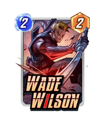
This is Wade Wilson in his prime, and Pandart has given him the full "main character" treatment. The art style is crisp, polished, and vibrant, and is classic Pandart. But what really sells this variant is the sheer confidence radiating off of it.
He's got that smirk that says, "I know I'm going to win this turn," and the dynamic pose with the katana swooping across the frame adds incredible movement. The lighting is fantastic, with the red glow from below highlighting the sharpness of his jawline and the steel of his blade. It's a stark contrast to the gritty, scarred versions of Deadpool we usually see. Wade Wilson is the smooth-talking mercenary who charmed his way through the underworld before the tragedy struck.
For the split, this card is begging for a Gold Finish. The warm tones of his skin and the red of his vest would look amazing against a gold background.
Flaviano Drops the Mic (And the Spell)
Artist: Flaviano
Source: Super Rare Pool
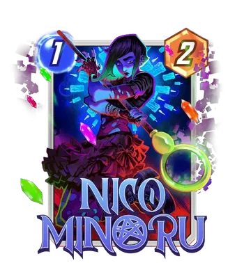
Pure eye candy. Flaviano's signature style, that incredible use of neon lighting and sharp, angular shading, is a perfect match for Nico's magic. The composition here is just explosive. She isn't just standing there; she is in the middle of casting something massive, with the Staff of One front and center.
The color palette is the real star, though. The mix of deep purples, electric pinks, and that toxic green in her hair creates a "magical punk" vibe that fits the Runaways' aesthetic flawlessly. The floating crystals add so much depth to the frame, making it feel like the magic is popping right off the card.
For the split, you have a couple of fantastic options. A Gold Finish would look incredible, picking up the gold of the Staff and the warm highlights in the background. But honestly? An Inked Split with a Neon Green or Purple Krackle is the endgame here. The high contrast of Flaviano's linework looks stunning in black and white, and the colored flare would perfectly mimic her spell effects.
The King of Wakanda Returns
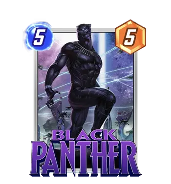
Artist: In-Hyuk Lee
Source: Daily Shop / Unknown
This artwork is originally from the 2018 Black Panther #1 retailer incentive cover, and it is easily one of the most majestic depictions of T'Challa out there. In-Hyuk Lee is a master of texture and lighting, and he flexes every bit of that skill here.
The composition is regal. T'Challa is perched atop a massive panther statue, surveying his kingdom. The lighting is moody and atmospheric, with that signature Wakandan purple haze illuminating the vibranium weave of his suit. Unlike the high-action poses of the pixel variants we just looked at, this one is all about quiet power. He seems calm, confident, and completely in control. The detail on the suit musculature is incredible! It looks like practical armor rather than just spandex.
For the split, you have to respect the crown. A Gold Finish is the top-tier choice here. It mimics the golden sunset of the Savannah and makes the purple logo and lighting pop even harder. Pair it with a Purple Border or a Gold Border to complete the royal aesthetic. If you get an Inked Split, aim for a Purple Krackle or the Vibranium split to keep the Wakanda energy alive.
12/06
Alex Dos Diaz Drop
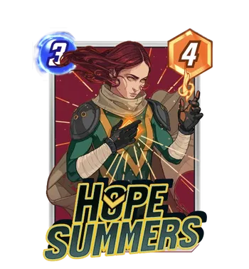
Artist: Alex Dos Diaz
Source: Super Rare Pool
Alex Dos Diaz has this incredible ability to make characters look regal and dangerous at the same time. This variant leans heavily into the "Messiah" aspect of Hope's lore.
She is rocking the classic green poncho look, which is a fantastic homage to her upbringing with Cable in the future. It feels rugged and practical, contrasting perfectly with the mystical, glowing energy she is channeling. The "finger gun" gesture is such a great touch. It is playful, but with her powers, you know it mimics something devastating. It gives off serious "I don't need a weapon, I am the weapon" energy.
For the split, you have to go gold. The gold background will blend seamlessly with the yellow accents on her suit and the geometric halo, making the whole card look like a religious icon for the X-Men. Pair it with a Red Border to match the background and her hair, or a Gold Border if you want to go full luxury.
12/08
Sweeney Boo Brings the Heavy Metal
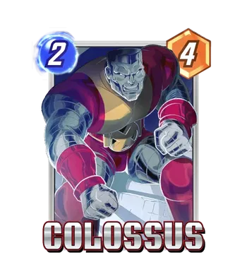
Artist: Sweeney Boo
Source: Rare Pool
If you know Sweeney Boo from her incredible Rogue or Captain Marvel variants, you know she has a gift for making characters look effortlessly cool. With Colossus, she brings that same smooth, animated energy to the strongest member of the X Men.
This variant feels like a frame from a high-budget animated series. The metal texture is the standout feature here. Instead of the hyper-realistic chrome we often see, Sweeney uses soft blue and white highlights to give him a polished, almost liquid metal look. It contrasts beautifully with the deep burgundy and yellow of his classic uniform.
The pose is fantastic too. Colossus is crouched low, fists clenched, looking like an immovable object ready to tank a Destroyer blast. It captures Piotr's protective nature perfectly without sacrificing any of his intimidation factor.
For the split, the yellow in his costume will blend seamlessly with the gold background, making him look like a solid gold statue. Pair it with a Red Border to match his tunic, or go for a Blue Border to complement the shading on his steel skin.
💥 SEASON PASS GIVEAWAY 💥
BANG BANG!
It has been a great start to the NEW season, and as promised, I want to get one of you into the action immediately.