It's Beginning to Look A Lot Like SNAPMUS!
It is officially the most wonderful time of the year! I hope you have your holiday shopping done, but if not, you can treat yourself to some of these incredible artworks dropping this week.
We have a massive list to go over, from the pop-star energy of Galacta to the gritty realism of the Weapon X program, along with a TON of new cards. Some coming from that new LTGM Team Clash! As always, grab your favorite warm beverage (preferably cocoa this week) and take a walk with me as we analyze the amazing art making its way into MARVEL SNAP!
12/16
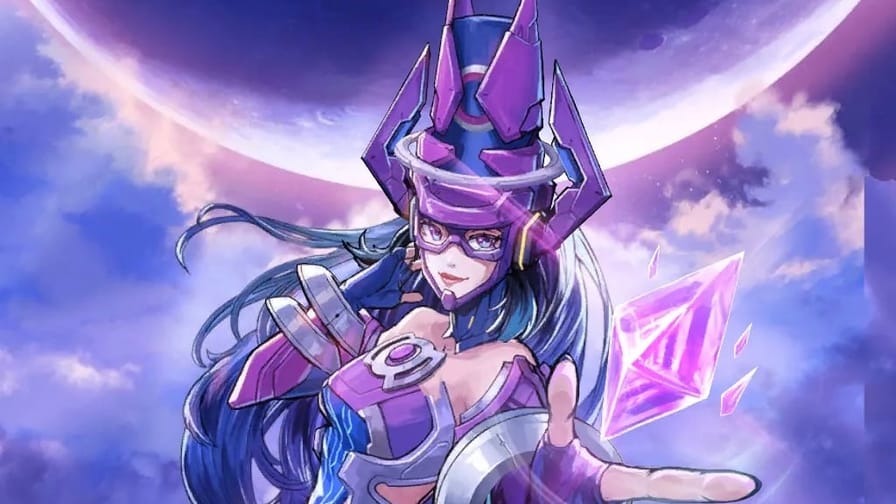
Galacta: The World Eating Pop Star!

Artist: Yo Shimizu
Source: Bundle - Cosmic Idol
Yo Shimizu has delivered an absolute masterpiece here. The lighting is what sells it. Look at the way the light refracts through that pink crystal and bounces off her visor. It gives the card a high gloss, premium anime statue feel that stands out aggressively against the usual comic art we see. The soft purples and neon blues of her armor are sleek, modern, and make her dad's outfit look like dusty antique furniture in comparison.
There is something hilarious and fantastic about the massive, floating helmet horns. They retain that terrifying Galactus silhouette, but framing her face like that makes it look like high-end sci-fi headphones.
For the split, do not overthink this. You need the Neon Pink Border. It matches the massive GALACTA text at the bottom and coordinates perfectly with the crystal she is holding. If you are lucky enough to get a Gold Finish, keep it!
Maverick: Heavy Metal Mercenary!

Artist: SUPJA
Source: Spotlight Variant
SUPJA has absolutely nailed the vibe of a mercenary who charges extra for the danger pay.
This variant is all about that aggressive perspective. The way that the gun is leveled right at the viewer immediately grabs your attention. It is not just a pose; it is a threat. The armor plating is rendered beautifully here, with that signature yellow and gold sheen looking heavy, metallic, and capable of taking a severe beating. It contrasts perfectly with the icy, frozen blue background, making Maverick pop right off the frame.
This guy is wearing enough metal to build a small car, yet he still manages to look agile. That is the magic of comic logic! I love the wires and the tech details around the helmet. It gives him that classic Weapon X, unfinished science experiment look that we all secretly love. He looks like he is ready to drop into a hostile zone, complete the mission, and not even scratch the paint job.
For the split, this one is screaming for a Gold Finish. It would blend seamlessly with his massive shoulder pads and chest plate, turning the entire card into a solid nugget of gold on the board. If you want to lean into the environment, a Blue Neon Border would pick up the icy tones of the background and his under-suit, framing that yellow armor perfectly.
12/17
Elsa Bloodstone: The Anime Protagonist We Deserve!

Artist: Creative House Pocket
Source: Bundle - Magic & Munitions
If there was ever a variant that proved you can hunt monsters and still look absolutely adorable while doing it, this is the one. Creative House Pocket has given Elsa Bloodstone a complete anime makeover, and honestly, it works way better than it should!
First off, we have to talk about that weapon. That is not just a gun; that is a portable cannon. It is roughly the size of Elsa's entire torso, yet she is hoisting it over her shoulder like it weighs absolutely nothing. I love the confidence in her expression. She is not looking at the target; she is looking back at us with a smirk that says "I got this" before she blasts a vampire into dust.
The colors here are fantastic. Elsa's signature bright orange hair is flowing wildly, creating a beautiful sense of motion that frames her face perfectly. The contrast between her dark, tactical outfit and the vibrant background ribbons makes the character model pop right off the card. It gives her a high-energy, magical girl warrior vibe that stands out in a game full of serious comic book art.
For the split, you have two great options. A Gold Finish would look incredible, matching the gold trim on her weapon and the massive ELSA text at the bottom. However, if you want to lean into her name and the fiery energy of her hair, a Red Neon Border would make this card look dangerous and aggressive in the best way possible.
Maverick: Heavy Metal Mercenary!

Artist: PANDART STUDIO
Source: Super Rare
First off, the lighting here is incredible. The gold plating on Maverick's armor has this heavy, metallic sheen that makes him look expensive and dangerous at the same time. The way the light hits the shoulder pads versus the matte fabric underneath adds a level of realism that PANDART always seems to nail.
I also love the duality of the weapons here. You have that massive, futuristic blue energy pistol in one hand and that raw, chaotic red energy gathering in the other. It creates this perfect balance of "I can shoot you from over here" or "I can blast you if you get too close." It is aggressive, loud, and fits the mercenary vibe perfectly.
For the perfect split, you have a few great options. A Gold Finish is the obvious choice to blend seamlessly with that golden armor; it would make the entire card look like a solid gold trophy. However, if you want to make those weapons pop, a Red Neon Border would pick up the energy in his left hand and make the whole piece look intimidating and volatile.
This variant is a must-have for anyone who loves the gritty, 90s era Sci Fi aesthetic!
12/18
Toxie Doxie: A Kiss to Die For!

Artist: Creative House Pocket
Source: Bundle Poisoned Kiss
Creative House Pocket returns with another absolute banger of a variant! This studio has a knack for taking characters and giving them this crisp, vibrant anime aesthetic that leaps off the screen.
This Toxie Doxie variant is equal parts charming and alarming. The pose is classic: she is blowing a kiss to her opponent. However, instead of hearts, we are getting a swirl of toxic green gas. It is the ultimate "kill them with kindness" energy. I absolutely love the expression on her face; it is confident, a little sassy, and fully aware that she is about to ruin your game plan.
The coloring here is fantastic. The transition from Toxie Doxie's pristine white outfit to the sickly sweet greens and teals of the smoke creates a beautiful contrast. And can we talk about those glasses? The orange tint adds such a cool, retro futuristic scientist vibe to the whole look. She looks like she belongs in a high-budget spy movie as the villain you secretly root for.
For the perfect split, you have to lean into the toxicity. A Green Neon Border is non-negotiable here. It would match the smoke and the accents on her suit perfectly. If you are lucky enough to get a Green Krackle, it would look like the poisonous gas is literally spilling out of the frame and onto the board.
Forge: The Tech Warlord!

Artist: PANDART STUDIO
Source: Super Rare
Forge is looking like the main character of his own high-budget anime here! PANDART has taken the mutant inventor and turned him into a super soldier. The detail on the cybernetic components is razor sharp, and the golden armor plating looks incredibly premium.
I love the pose; he is not just building something, he is powering up. The energy crackling around his hands and the focused determination on his face sell the idea that he is about to drop a game-winning invention. The background explosion of debris adds to the chaotic battlefield vibe.
A Gold Finish is the only correct choice here. It would blend seamlessly with his yellow and blue X-Men uniform and that shiny armor, making the whole card look like a solid gold brick. Pair it with a Blue Krackle to match the energy effects, and you have a top-tier variant.
Marrow: Sharp, Stylish, and Deadly!

Artist: PANDART STUDIO
Source: Super Rare
Marrow is one of those characters that can be difficult to depict without just looking like madness, but PANDART STUDIO absolutely nailed the balance here. They managed to make her look sleek, agile, and incredibly lethal.
They leaned heavily into an anime action aesthetic for this piece. The perspective is top tier; having that massive bone blade swooping into the foreground creates a fantastic depth of field. It truly looks like she is slicing right through the screen and into your hand.
The lighting on her armor and hair features that signature PANDART polish: smooth, perfectly rendered, and popping with color. I especially love the pink energy trail following the blade. It is a brilliant touch that adds speed and motion to a static image. She does not just look strong; she looks fast.
For the split, you have to go with a Neon Pink Border. It picks up the color of her hair and the energy swoosh perfectly, tying the whole color palette together. A Gold Finish would also look spectacular, making that deep blue suit stand out sharply against the gold background.
Wild Child: Unleash the Beast!

Artist: PANDART STUDIO
Source: Super Rare
This Wild Child variant is pure nightmare fuel in the best way possible. PANDART often leans into the "cool" factor, but here they went full feral. The way he is crouched, ready to pounce, with those glowing eyes and the saliva dripping from his fangs, is genuinely intimidating.
The lighting is spectacular, casting deep shadows that emphasize his musculature and the wild flow of his hair. It gives the card a sense of raw, untamed energy that fits his name perfectly. He looks like he is seconds away from tearing the frame apart.
For the split, I would go with a Red Neon Border to match the intensity of those glowing eyes. An Ink Finishwould also be terrifyingly good, stripping away the color to leave just the monstrous form and lighting effects.
Fastball Special: The Ultimate Combo!

Artist: PANDART STUDIO
Source: Super Rare
This is it. The card we have all been waiting for! The "Fastball Special" is legendary, and PANDART captures the momentum perfectly. You can feel the weight of Colossus and the speed of Wolverine as he's launched into the fray.
The composition is fantastic, using the circular motion lines to guide your eye and create a sense of explosive speed. It is dynamic, kinetic, and captures the perfect teamwork between these two icons. The expressions are great too; Colossus looks stoic and focused, while Wolverine is just pure, flying rage.
This card deserves a Red Krackle to match the speed lines and Wolverine's aggression. It makes the "throw" look even more impactful, like he is breaking the sound barrier.
The SUPJA Spotlight Showcase!
The Spotlight variants keep getting better, and this week we are being treated to a phenomenal batch from the incredible SUPJA!
Let's break down these three masterpieces!

This variant is pure kinetic energy. SUPJA captures the exact split-second moment of the throw, with Colossus grounded like a mountain and Wolverine launching forward like a missile.
The perspective here is genius. By tilting the angle, the artist makes you feel the sheer velocity of the toss. Wolverine isn't just jumping; he is being fired. The expressions are perfect, too, as Colossus is the picture of stoic concentration, while Logan is a snarling ball of adamantium rage. The coloring is vibrant and clean, making the yellow of Wolverine's suit pop beautifully against the motion lines.
Best Split: A Gold Finish is the dream here. It matches Wolverine's suit and gives the whole scene a legendary, "classic comic cover" vibe.

If you thought Wild Child couldn't get any more feral, think again. SUPJA has turned the dial up to eleven. This variant leans heavily into the "beast" aspect of the character.
What really sells this piece is the lighting. The way the shadows play across his fur and muscles gives him a dangerous, unpredictable look. The glowing eyes are the cherry on top, piercing through the scene and letting you know that he is not here to play nice. It is gritty, it is intense, and it captures the essence of the character perfectly.
Best Split: Go for a Red Neon Border. It will match those terrifying glowing eyes and make the card look like a warning sign on the board.

Marrow often looks scary, but SUPJA has managed to make her look incredibly cool. This variant focuses on her agility and combat prowess rather than just the body horror elements. The bone spikes have a sharp, metallic-like sheen that makes them look like precision weapons.
She is mid-strike, balanced, and deadly. I love the color palette here; the deep blues of her suit contrast sharply with the pale, ivory tones of the bone armor. It gives the card a sleek, modern look that stands out in any hand.
Best Split: An Ink Finish with a Red flare would look amazing. It would emphasize the stark contrast of the bone elements and give the card a gritty, manga-style appearance.
12/19
Alioth: The Living Tempest!

Artist: Envar Studio
Source: Super Rare
Envar Studio has taken the formless entity of Alioth and given it a terrifying, electrifying presence.
Alioth is not just a purple cloud; it is a raging storm of destruction. The contrast between the deep, void-like blacks of the body and the searing pink and purple lightning is absolutely stunning. It gives the card a sense of internal illumination, like there is a massive amount of power barely being contained within that smoky form.
The face, or what passes for a face, is the stuff of nightmares. That glowing, screaming maw makes it look like it is mid-roar, ready to consume everything in the lane.
For the split, you have an apparent winner here. A Neon Purple Border is mandatory. It would connect with the lightning effects and frame the dark art perfectly. If you want to get fancy, an Ink Finish with a Purple Kracklewould make it look like a black hole surrounded by dark energy, which is pretty much precisely what Alioth is.
12/20
Zabu: The Cutest Apex Predator!

Artist: Mooncolony
Source: Rare
The first thing that grabs you is those massive, glowing green eyes. They are vibrant, expressive, and heavily contrasted against the soft orange of his fur. He looks playful, crouched low on that branch like he is about to pounce on a ball of yarn rather than a Devil Dinosaur.
Do not let the cuteness fool you, though. The sharp fangs and the claws digging into the wood are a subtle reminder that this little guy is still a predator. The lighting is soft and magical, giving the whole card a storybook quality that really stands out against the more intense action variants in the game.
This Zabu variant is a perfect pickup for anyone who loves the "Baby" or "Chibi" aesthetic but wants something with that distinct Mooncolony polish.
For the perfect split, you have two great paths. A Green Border is essential to match those mesmerizing eyes and the jungle background.
12/22
Ajax: Tiny Temper, Big Shield!

Artist: Dan Hipp
Source: Rare Pool
We are wrapping up the week with a colorful punch from the legendary Dan Hipp! You always know a Hipp variant when you see it, and this Ajax is an instant classic.
The color palette here is electric. The vibrant blues of Ajax's armor pop right off the card, especially against that hot pink and purple background. It is loud, it is chaotic, and it fits the energy of the card perfectly.
My favorite part has to be the expression. Ajax looks so furious, shouting orders (or maybe just shouting), but in that signature Hipp style, it comes across as weirdly charming. And that shield! It is massive, glowing with energy, and takes up half the frame. It really sells the idea that this is a guy you do not want to mess with, even if he does look like a Saturday morning cartoon villain.
For the split, Dan Hipp variants always look incredible with a Gold Finish. The flat, bold colors he uses translate perfectly to the gold background. Pair it with a Blue Krackle to match his armor and shield, and you have a card that is going to be the envy of your opponent.
THE WRAP-UP
BANG BANG! From the terrifying Alioth to the adorable Zabu, we have a little something for everyone. I can not wait to see everyone's splits in the SNAP.Fan discord!
Let me know which is your favorite variant of the week in the comments, and I will send you my best split of it!
Until next time, keep collecting those variants, and I'll catch you all in the next one. Peace!