
'TIS THE SEASON OF GIVING!
Is it just me, or does Second Dinner have a personal vendetta against our savings accounts this month? 'Tis the season for giving, but right now, I am mostly giving my gold bars to the shop. But honestly, can you blame me? We have adamantium monsters, fashion icons, and a potato dog all landing in the same week.
Grab your favorite beverage (hide your credit card statement), and let us take a walk through the absolute heat dropping in Marvel SNAP this week after we take a look at the Grand Arena OTA.
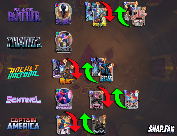
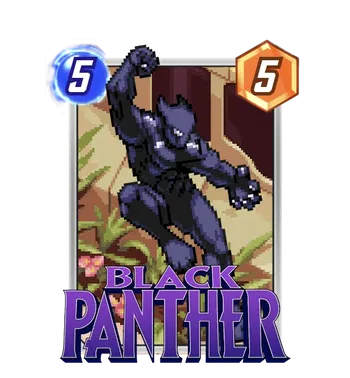
- Skill from 5 cost to 6
- Grandmaster, Shuri -> Sebastian Shaw, Awesome Andy
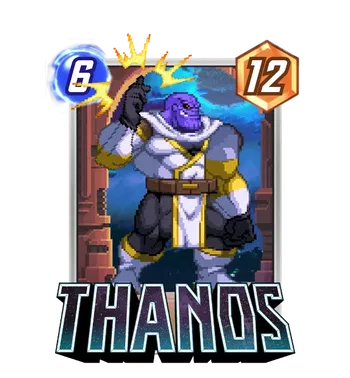
- Skill from 4-cost to 2-cost
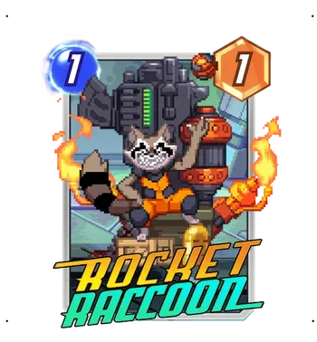
- Gamora, Groot -> Beast, Prowler
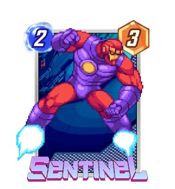
- 4-Cost skill to 3-Cost
- Bastion -> Kahhori
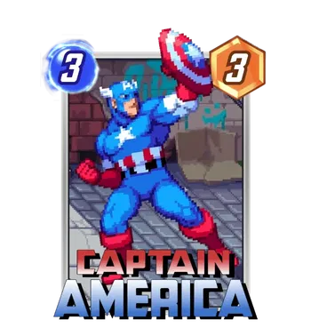
- Captain Carter -> Punisher
12/09
The Best of Both Worlds: Weapon H Smash!
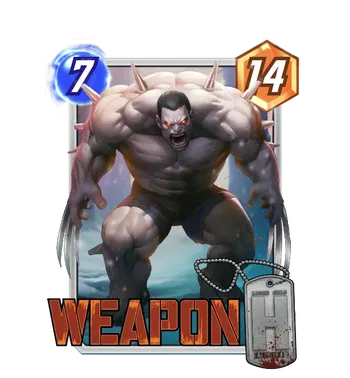
Artist: SUPJA Source: Spotlight Variant
Okay, let us be real for a second. If you ever looked at the Hulk and thought, "You know what this guy needs? Giant adamantium knives coming out of his hands," then Marvel clearly read your diary. This variant by SUPJA is absolutely terrifying in the best way possible.
It is basically what happens when you let a mad scientist design a gym routine. The sheer mass of this unit is ridiculous. You have the size and raw power of the Hulk mixed with the lethal precision of Wolverine, and SUPJA captures that mashup perfectly.
The gray skin tone makes him look like a living statue that just woke up and chose violence, while those glowing red eyes scream, "I have not had my morning coffee."
The details are what really sell this one for me. The bone spikes protruding from Weapon H's shoulders and arms add this gnarly, prehistoric texture that separates him from just being a "Grey Hulk with claws." And speaking of claws, look at the length of those things! They are not just for show; they look heavy and dangerous. The oversized dog tags in the foreground are a nice touch, too, reminding us that somewhere inside that monster is a soldier who probably regrets signing up for this particular experiment.
Colleen Wing: Dressed to Kill (Cleanly)
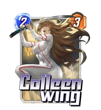
Artist: Aruana Sick
Source: Promo
Listen, wearing an all white bodysuit to a sword fight is a massive flex. It basically says, "I am so good at my job that I am not going to get a single drop of anything on this outfit." This variant by Aruana Sick is sleek, stylish, and looks like it came straight out of a high-budget anime opening sequence.
The dynamism here is top-tier. Colleen is crouched low, coiled like a spring, and ready to slice through that Apocalypse or Swarm in your hand with absolute precision. The perspective on the blade is excellent, but I am mostly impressed by the hair volume. That is not combat hair; that is "I spend a lot of money on conditioner" hair. It flows beautifully and adds a ton of motion to the piece. The red racing stripes on the suit break up the white perfectly, leading your eye right through the action.
It is a clean, sharp look that stands out because it is not trying to be overly gritty. It is just cool.
For the split, you have to go with a White Neon Border. It is a complete no-brainer. It extends that pristine white suit right to the edge of the card and makes her look incredibly elite. If you want to be a little different, a Red Matte Border would pick up those accent lines nicely, but honestly, keep it white. It just looks too fresh to mess with.
Scorn: The Ultimate Upgrade
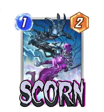
Artist: Sunghan Yune
Source: Bundle Synthetic Host
We are wrapping up the drop with a variant that is equal parts terrifying and technological. Sunghan Yune gives us a Scorn that looks less like a biological accident and more like a military weapon system gone wrong.
The perspective here is absolutely killer. That massive mechanical claw in the foreground is reaching right out of the frame, looking like it wants to snatch your cubes personally. I love the blend of organic purple symbiote texture with the cold steel of the cybernetics. It captures exactly what Scorn is supposed to be: a living machine. The blue lightning crackling in the background adds a frenetic energy, making it feel like she is overcharged and seconds away from exploding.
Also, can we talk about the wires? As someone who stresses about cable management under my desk, seeing all those loose cables flying around gives me anxiety, but it undoubtedly looks cool. It sells the idea that Scorn is plugged into something greater and dangerous.
For the split, I am going to recommend a Purple Neon Border. It will perfectly match the purple tones of her suit and tie the whole tech aesthetic together. If you want to lean into the electricity, a Blue Krackle on a foil background would also look electric, matching the lightning effects beautifully.
12/10
Weapon H: The Cool Guys Don't Look Back
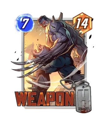
Artist: PANDART STUDIO
Source: Super Rare
PANDART Studio rarely misses, and they have absolutely nailed the sheer scale of Weapon H here. If the previous variant was about raw horror, this one is about cinematic action. It gives off major "walking away from an explosion in slow motion" energy, which is exactly the kind of vibe you want for a card that drops a massive amount of power on the board.
The angle is fantastic because it emphasizes the impossible width of his back and shoulders. You really get a sense of the Hulk DNA working overtime. The lighting is warm and dramatic, bathing him in an orange glow that contrasts beautifully with his slate grey skin. And those claws! They are gleaming with a polished shine that suggests his claws were sharpened or cleaned recently, which is a terrifying thought given what he likely uses them for.
I also appreciate the dynamic motion of the dog tags swinging in the foreground. It adds a small but necessary layer of depth to the composition. Weapon H looks unstoppable, like a tank with a bad attitude and adamantium upgrades.
For the split, you definitely want to chase a Gold Foil. The background is already rich with warm yellow and orange tones, so a gold finish would look seamless and incredibly premium. If you want to match the destruction, an Orange Krackle would be the perfect cherry on top, making it look like the world is literally burning around him.
The Collector: Drip or Drown
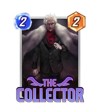
Artist: Creative House Pocket
Source: Bundle Collection Complete
If Taneleer Tivan ever decided to stop hoarding Infinity Stones and start hoarding designer labels, this is precisely what he would look like. This variant by Creative House Pocket drops the creepy cosmic hoarder vibe and replaces it with pure, unfiltered wealth.
He looks like he just bought a controlling stake in a casino to kick you out of it. The pinstripe suit is sharp enough to cut glass, but the real star here is that massive fur coat. It is excessive, ridiculous, and absolutely perfect for a character whose entire personality is "I have more stuff than you." The red shirt adds a nice pop of color that hints at his more villainous side, while the pose adjusting his lapel screams arrogance.
The background is dark and straightforward, which works because it keeps all the focus on the man and his expensive wardrobe. It is a clean, high-fashion look that stands out on a board usually filled with spandex and armor.
For the split, you have one option and one option only: Gold Foil. The man is literally The Collector; he needs to appear as if he is made of money. A Gold finish with a Gold Matte Border would be the ultimate flex, turning the card into a trophy that looks like it costs more than your opponent's entire deck.
Wave: The Vibe Check
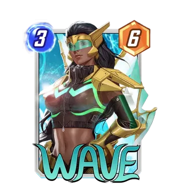
Artist: In-Hyuk Lee
Source: Bundle Wave Check
In-Hyuk Lee has taken Pearl Pangan out of the ocean and dropped her straight into a cyberpunk thriller. This variant is a massive departure from her usual aquatic aesthetic, and honestly, the upgrade is incredible. She looks less like a superhero and more like she runs a high-stakes hacking syndicate in Neo Tokyo.
The design here is all about the details. The tactical crop jacket paired with the gold armor plating gives Wave a look that is both defensive and fashionable. But the real showstopper is that green visor. It gives her such a mysterious, futuristic edge. Is she scanning your power level? Is she watching a movie while she floods the board? We will never know, and that is part of the charm.
The lighting is signature In-Hyuk Lee, making the different textures of the leather, metal, and skin pop realistically. The neon green glowing accents on her suit tie everything together and hint that her powers might be getting a digital upgrade.
For the split, a Green Neon Border is mandatory. It matches the visor and the glowing suit accents perfectly, creating a cohesive tech look. If you want to lean into the royalty of the gold armor, a Gold Finish would also look spectacular, but keep that border green to maintain the cyber aesthetic.
12/12
Victoria Hand: Per My Last Email
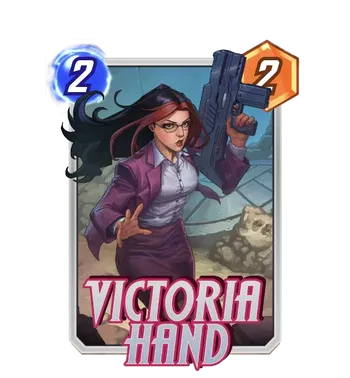
Artist: Creees
Source: Rare Pool
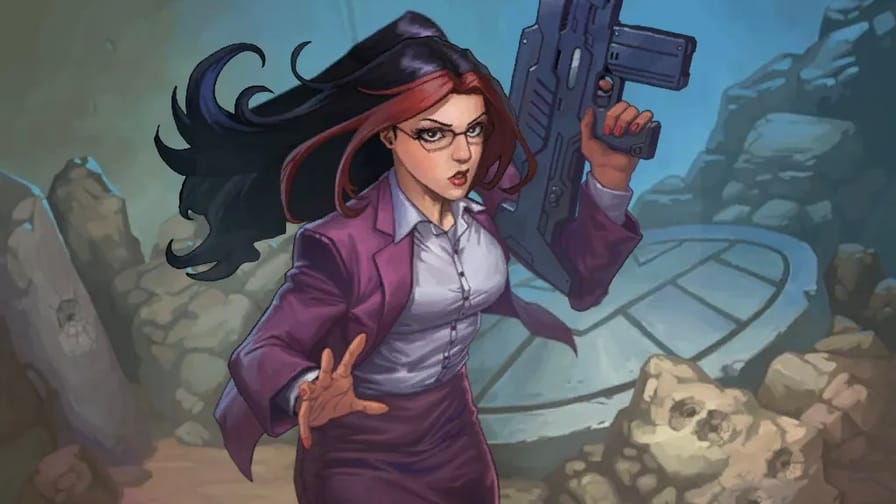
There is something inherently funny and awesome about a character wearing full business attire while holding a gun that weighs as much as a small car. This variant by Creees perfectly captures the essence of Victoria Hand, which is basically "I have a budget meeting at 4 and an alien invasion at 5."
The contrast here is what makes the card work. You have the crisp purple blazer, the sensible button-down shirt, and the glasses, all screaming "HR Director." Then you have a massive futuristic rifle that looks like it could blow a hole through a Helicarrier. She doesn't appear dressed for combat, but to fire you and has the heavy artillery just in case you refuse to sign the severance package.
Creees brings a great anime-inspired energy to the piece. The movement in her hair, specifically that signature red streak, adds a nice sense of motion to the static pose. She looks stressed but competent, like she is the only person on the team who actually read the mission briefing.
For the split, you have to match the suit. A Purple Neon Border is the best choice here. It highlights her blazer and makes the whole card look like a cohesive S.H.I.E.L.D. file. If you want to highlight her signature hair, a Red Matte Border would also look sharp and aggressive.
12/13
Lockjaw: The Goodest Boy in the Galaxy
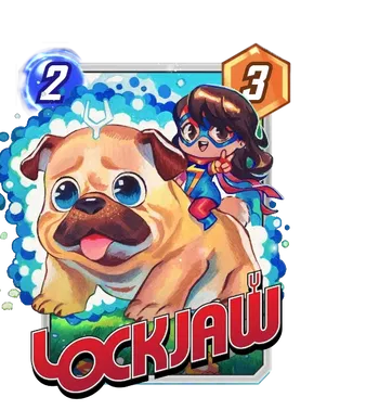
Artist: Rian Gonzales
Source: Super Rare Pool
Lockjaw might be the most dangerous card in the game, solely because it is impossible to be angry at it. Rian Gonzales is the undisputed champion of making powerful cosmic entities look like plush toys you want to squeeze until they pop.
Lockjaw is not a massive teleporting beast here; he is a potato. A literal, adorable loaf of bread that learned how to teleport. The way his tongue hangs out, and those massive, shimmering eyes look up at you, is weaponized cuteness. The variants' design tricks you into lowering your guard so you do not notice the Infinaut about to swap in.
I also love the addition of Ms Marvel riding on his back. It captures the fun, youthful energy of their team up perfectly. She looks like she is leading a charge into the most wholesome battle in history. The bubbles and soft blue textures in the background give the whole piece a light, refreshing feel that stands out against the usual dark and gritty comic art.
For the split, you want to keep it bright. A Gold Foil is the dream here. The warm gold tones will match Lockjaw's fur perfectly, turning the card into a golden ticket of happiness. If you can get a Blue Krackle to match the bubbles in the original art, you have officially won the game of Snap, regardless of your rank.
12/15
Album Showcase: Storms, Spies, and Surprises
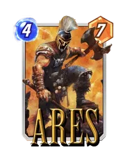
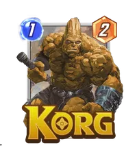
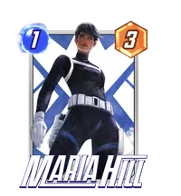
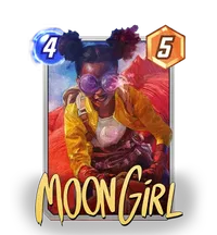
Artist: Viktor Farro
Source: Super Rare Pool
This album is a massive stylistic flex. Viktor Farro has a very distinct way of blending sharp, anime-inspired linework with dynamic, cinematic lighting. He takes characters we see every day and gives them a "fresh coat of paint" that feels modern and high-energy.
Here is the track-by-track breakdown of the 12 variants in the album:
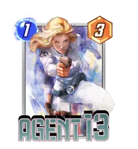
Agent 13: This is straight out of a spy thriller movie poster. She is in a full white tactical suit, sprinting forward with her gun drawn. The motion blur on the background makes it feel fast, and the white outfit is a bold choice for a spy—she wants you to see her coming.
Ares: Farro leans into the "God of War" grit here. Ares is decked out in classic hoplite armor with a massive axe, looking ready to chop a lane in half. The lighting is warm and dusty, making him look like he's in the middle of a battlefield.
Korg: Wait, is that a microphone? Korg appears to be doing stand-up comedy or karaoke. He's holding the mic with a rocky grin, which is a hilarious nod to his personality in the MCU. It's a fun, lighthearted break from the serious action in the rest of the album.
Maria Hill: Sleek, professional, and dangerous. She is wearing a tight tactical bodysuit with the S.H.I.E.L.D. logo essentially framing her in the background. The cool blue tones contrast perfectly with her stern expression. She looks like she just denied your clearance level.
Moon Girl: We covered this star! Roller skates, yellow jacket, pink bubblegum. It is pure kinetic energy and arguably the most colorful card in the set.
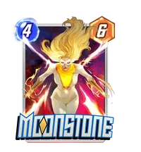
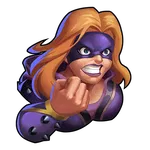
Moonstone: This one is all about power. Moonstone is flying straight at the viewer, glowing with golden energy. The perspective makes her look dominating, and that smirk says she knows she's better than whatever card you just played.
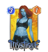
Mystique: Farro went for a "street style" look here. She's rocking blue jeans and a crop top, looking incredibly casual for a deadly shapeshifter. It's a great modernized look that makes her feel more grounded and less "superhero costume" than usual.
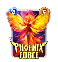
Phoenix Force: It is a giant, raging firebird. You can't go wrong with that. The colors are scorching bright—reds, oranges, and yellows that will look absolutely insane with an animated border. It's abstract, scary, and beautiful.
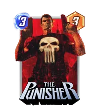
The Punisher: Frank Castle doing what he does best: double-fisting pistols with a giant skull on his chest. The red background (rain? blood? both?) gives it a neo-noir vibe that fits the character perfectly. It's gritty and violent.
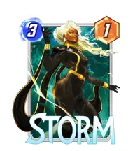
Storm: This is a queen in her element. She is controlling the weather with glowing eyes and lightning crackling around her fingers. The black and gold outfit is regal, and the rain effects are going to look top-tier when upgraded to 3D.
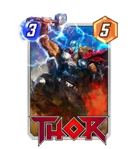
Thor: A classic action shot. Thor is winding up Mjolnir for a massive strike, surrounded by lightning. The energy here is electric (literally), and the pose is pure comic book heroism.
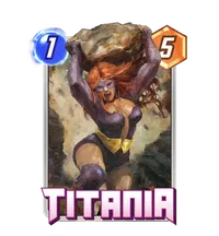
Titania: She is holding a boulder the size of a small house, like it's a beach ball. The display of strength is incredible, and her purple outfit pops nicely against the rocky background. She looks ready to throw that rock right at your opponent's face.
VOTE for your Favorite Variant (aka TeamCable)
Spider Ham: The Problematic Lunch
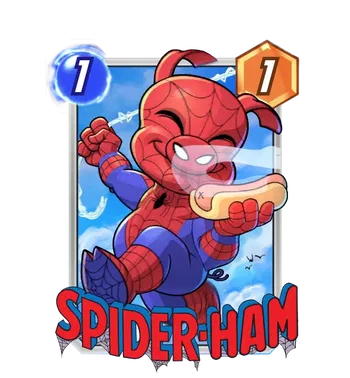
Artist: A.J. Nazarro
Source: Promo
We have to address the elephant, or rather the pig, in the room. Spider-Ham is eating a hot dog. A pig eating a hot dog. Is this cannibalism? Is it a beef frank? We do not know, and the look of pure joy on his face suggests he does not care. The wink and the smile are infectious, and the way he is casually holding a web line in one hand and his lunch in the other is just a total vibe.
The colors here are incredibly vibrant, with the red and blue of his suit popping perfectly against the fluffy white clouds in the background.
For the split, I am looking at a Blue Neon Border. It will match the beautiful sky background and the blue in his suit, keeping the whole card looking fresh and bright.
Cable: Father of the Year
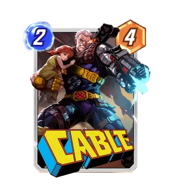
Artist: Creative House Pocket
Source: Unknown
Creative House Pocket returns with their signature anime-inspired style, and they have turned the intensity dial all the way up to eleven. This variant executes the "Lone Wolf and Cub" trope to perfection.
Cable looks absolutely massive here, a wall of muscle and cybernetics protecting the child, presumably Hope, tucked safely under his arm. The contrast is fantastic. You have this small, vulnerable child clinging to him, and then in his other hand, he is wielding a gun that is literally the size of a motorcycle engine.
The glowing orange flare from his eye and the blue muzzle flash from the weapon create a dynamic cross of colors that draws your eye right across the card. His expression is pure grit; he is not just fighting; he is protecting his family, and heaven help anyone who stands in his lane. The "CABLE" text at the bottom is bold and retro, adding a nice comic book flair to the composition.
For the split, a Gold Finish is the way to go. It will pick up the gold on his belt and the child's blanket, making the whole image feel legendary. A Red Matte Border would also look killer, matching the intensity of his eye and the urgency of the scene.
Jean Grey: The Phoenix Rises
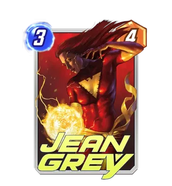
Artist: Lucio Parrillo
Source: Unknown
Lucio Parrillo is a master of making comic book characters look like they belong in a classical art museum, and this Jean Grey variant is a masterpiece. The texture and lighting here are just on another level.
Jean is not the friendly neighborhood Marvel Girl; this is a woman who is holding the power of a sun in the palm of her hand. The way the light from the energy ball reflects off her red suit and illuminates her face is breathtaking. The shadows are deep and dramatic, giving the card a serious, ominous tone.
Her expression is calm but focused, which is almost scarier than if she were screaming. The background is a deep, rich crimson, hinting at the Phoenix force lurking just beneath the surface. The realism in the painting style makes the energy effects look hot to the touch.
For the split, you have to go with a Red Neon Border. It is mandatory. It will frame that deep red background and her suit perfectly. If you get an Ink Finish with red glimmer flare? That is it. That is the endgame. You win the fashion snap.
THE WRAP UP
BANG BANG! Another perfect week of Variants in the books. I need to know: are you team Jean Grey, Cable, or Spider-Ham?
Let me know which is your favorite variant of the week in the Snap.Fan discord, and do not forget to share those splits! I cannot wait to see what gold and ink finishes you all unlock.