

Guys, are you ready? No, not for Christmas, or New Year’s… No, not for the upcoming mega blockbuster movie about Captain America… No, not for upcoming large system changes that will hopefully improve SNAP in a period of peak playerbase discontent…
Are you ready for another gigantic Round-Up article about all the new datamined variants? The last patch of 2024 just dropped, and with it we’ve gotten another glimpse at all the variant art we’ll be getting in the months to come. I’m excited that, after the secrecy surrounding the crossover, we’re back to business as usual with each patch’s huge haul of new variants. So what are we waiting for, jawing in the introduction? Let’s stop talking about the Round-Up and get to Rounding Up!
Upcoming Season Showcase: Viktor Farro, He Tianyou, and Rian Gonzales
Viktor Farro
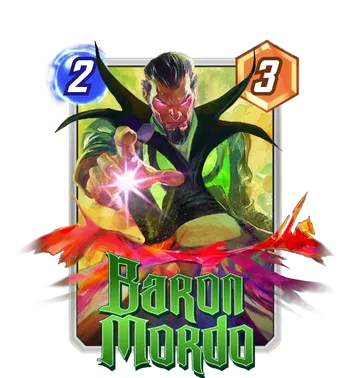
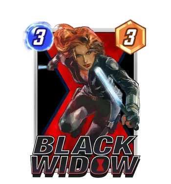
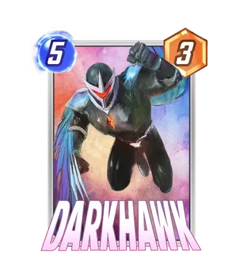
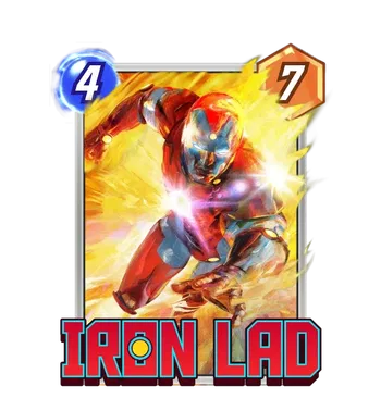
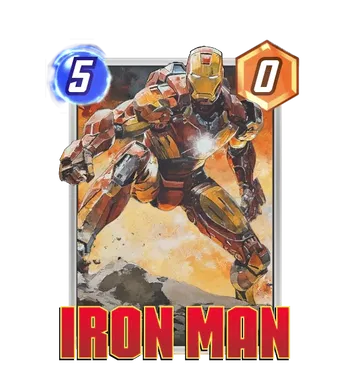
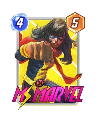
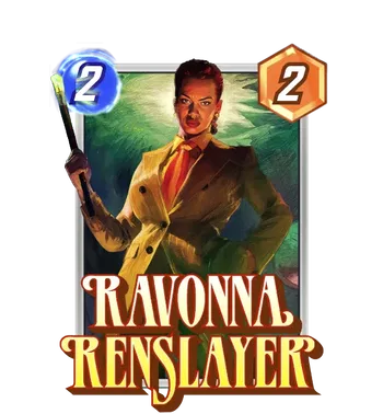
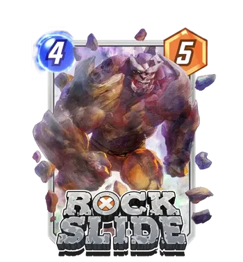
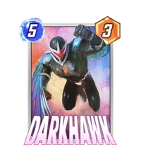
“Holy #@$%,” the author said out loud, before realizing he’d probably have to censor that in the article. Farro never really left, but if this was a return, it’d be one hell of one. He’s got a full series of variants coming out (alongside an album for all of them) and they’ve all got the full polish of that incredibly lush, painted illustration style Farro is known for. As far as SNAP is concerned, Farro’s Ms. Marvel and Ravonna here might just join his recent Shang-Chi as career highlights— his strength for genuine illustrated realism is incredible, and all reminds me of those old-school classic paperbacks and movie posters that drew on that same gorgeous realism to turn heads draw eyes. There’s a whole album with his upcoming stuff and recent SNAP work in the Asgard season below, and the reward for all twelve (a hefty price tag to be sure, but in my opinion a deserved one) will be a Farro Darkhawk, a great piece and a staple Series 4 card.
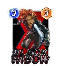
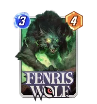
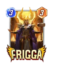
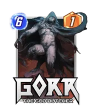
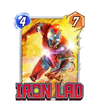
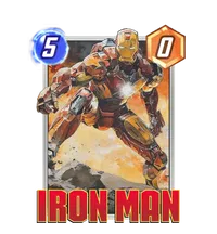
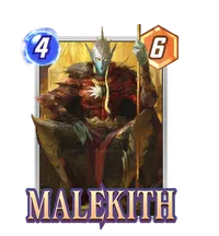
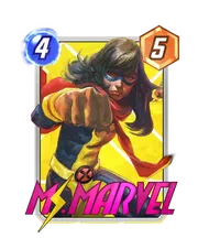
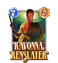
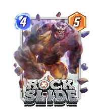
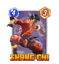
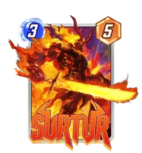

Miscellaneous notes: I didn’t realize how much I missed a classic film-style Iron Man until Farro brough it back in glorious painted high definition; I adore that cards like Baron Mordo, Rockslide, and Iron Lad are given the same incredible art attention as the other big names; and, uh, the album title’s pun might be how to actually pronounce Farro’s surname. Farro, Wherever You Are-O, indeed.
He Tianyou
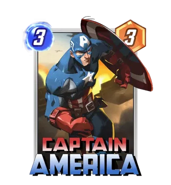
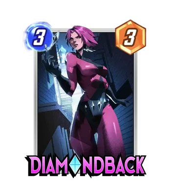
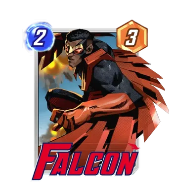
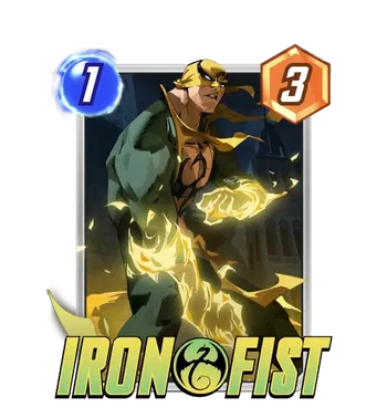
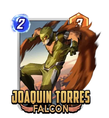
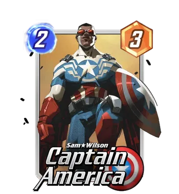
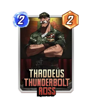
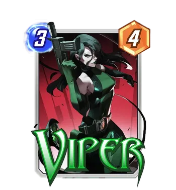
Not to be outdone, it seems He Tianyou will be the designated Spotlight variant artist for the February Captain America month, and he shows up in a big way. I already mentioned that he had a super strong debut in the last round-up— his Bob and Black Swan were instant fan-favorites, and I think his follow-up work is poised to be the same. He’s established a clear visual style that prioritizes sharp, dramatic lighting and strong, angular, muscular shapes that reminds me of a lot of the hyper-stylized comic art from the 2000s that I remember: a style that prioritizes dynamism and energy. I particularly enjoy the Spotlights for Diamondback, Joaquin Torres, Redwing, and Thaddeus Ross, and— whoops, that’s all of them. But we’ve also got great Season Pass variants for Falcon and both Captains America, and even a yoked Iron Fist without a release date; hopefully that signals that Tianyou is here to stay, beyond February’s Brave New World.
Rian Gonzales
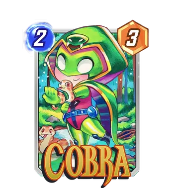
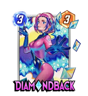
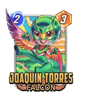
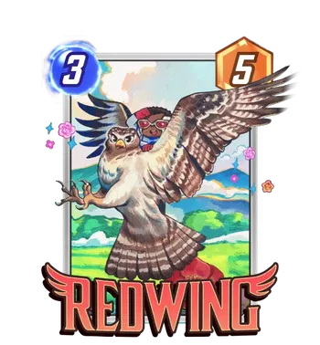
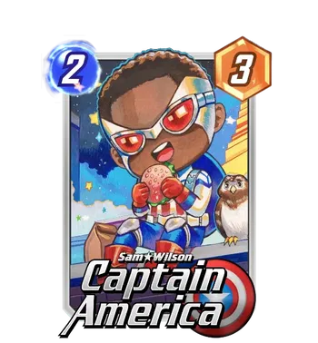
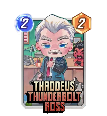
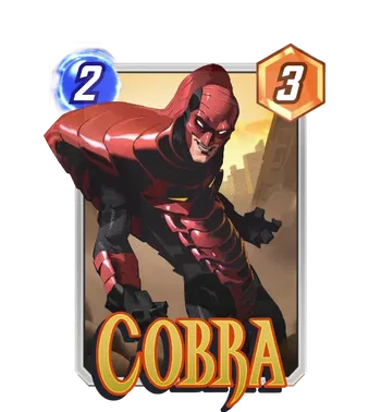
Finally, Rian Gonzales reprises a common role here, holding it down as the shop variant artist for all the new Spotlight cards for February. A similar thing happened during the Asgard season, where Andrea Guardino was the Spotlight artist and then Farro had his own run of shop variants for those same cards: I suspect this is going to be a variant rollout cadence we’ll see more often down the line. Either way, fans of Rian’s chibi work will no doubt enjoy these; even if you don’t, you can probably appreciate the charm of a tiny Sam Wilson riding a regular size Redwing. And hey! Like many cards like them, these SNAP commissions are probably the most art attention Diamondback and Cobra have gotten in a very, very long time.
Lemon Art’s High Fashion SNAP Magazine
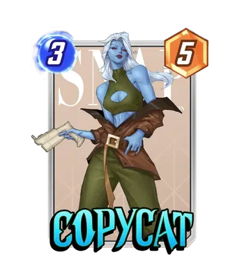
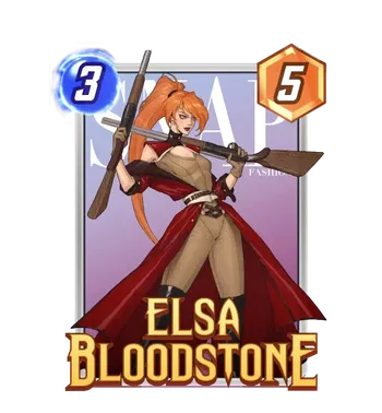
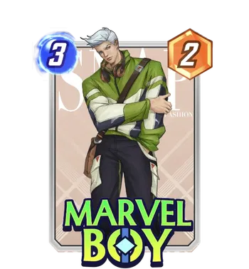
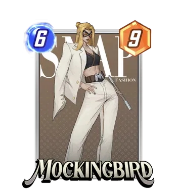
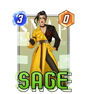
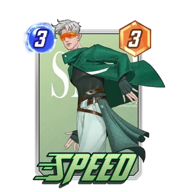
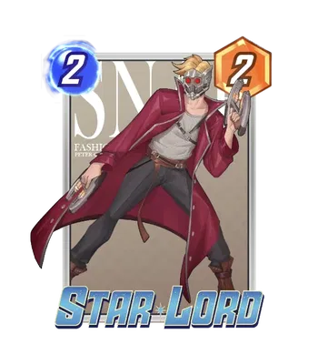
If you enjoyed the haute couture and high fashion vibes of the Hellfire Gala, these might tickle you: Lemon Art’s small series of SNAP magazine variants has ballooned, with an influx of new chic variants featuring a variety of SNAP’s more comic-obscure characters decked out for their own function. It’s not quite the Hellfire Gala— these commissions don’t quite reach the highs of the Gala proper in the comics, nor do they feel quite as polished as Manhanini’s SNAP-specific work for the Hellfire Gala season last year. But there’s an album with an Elsa Bloodstone at the end of the 8-variant tunnel: and if you’re just hungry for some more fashion flexing in your game, this just might be your next project.
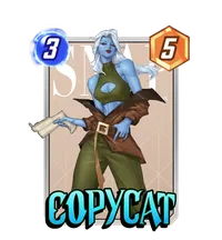
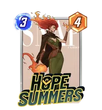
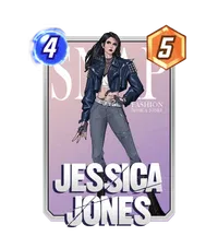
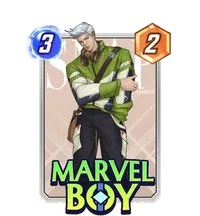
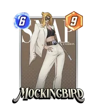
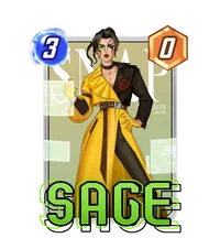
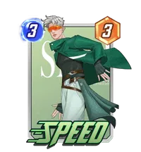
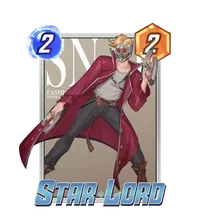
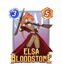
For my money? The standouts are probably Copycat and Speed, both of whose outfits feel particularly well suited, and both of whom have relatively little to work with as far as existing art to turn into variants. In general, it’s always nice to see a new style and aesthetic in the game continue to get represented!
Snap or Pass? Dating Profile Variants
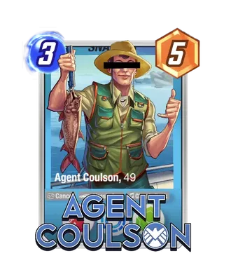
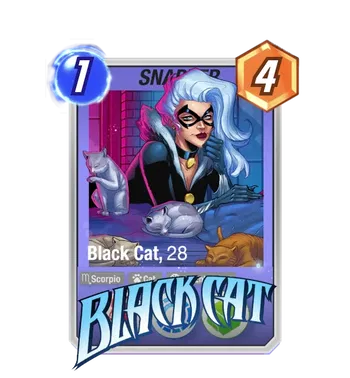
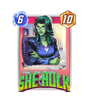
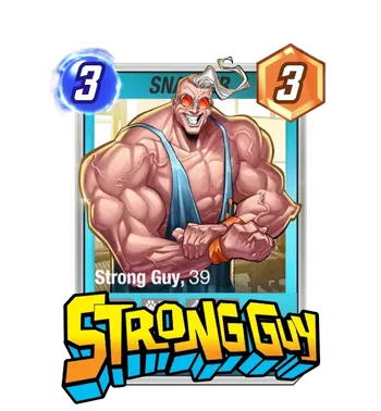
Speaking of new styles and aesthetics, we’ve got an amusing new series in these Dating Profile variants for Coulson, Black Cat, She-Hulk, and Strong Guy. Besides putting an age to these eligible bachelors and bachelorettes, these variants are a bit more clever than the average Mello/Kinnaird gag variant, recontextualizing the entire card as a snapshot of a dating profile. I especially love the redacted eyes on Coulson— the rest, though, are also competently done (and seemingly colored by Kinnaird in a slightly different style than his normal work), and a solid reminder that these artists often work to specifications, and are capable of many different things given the latitude. Spoilers for later: Mello flexes a bit this patch, reminded us he’s a perfectly formidable draftsman with the lineart.
Other Returning Favorites!
Andrea Guardino
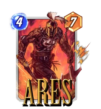
Guardino gets a reprise/encore for his Asgardian work with a similarly mythic Ares, different pantheon be damned. And, perhaps, damned literally— this hellish Ares has burning eyes and the flames of war in the background, giving some much more foreboding gravity to the Greek God of War turned hero-ish. It’s some of Guardino’s biggest strengths at play here: clear composition, painted dramatic lighting and color, and some plain menace in his figures.
Jon Lam
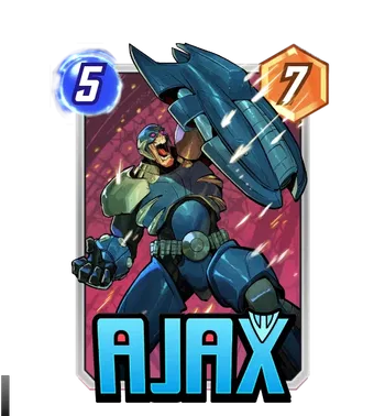
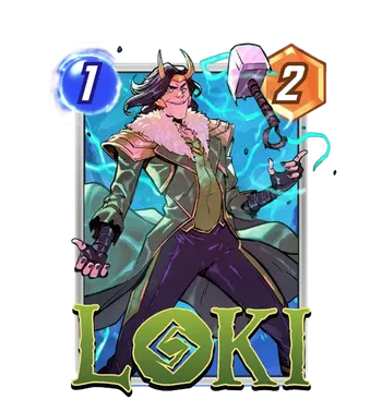
Jon Lam’s relatively limited domain in SNAP’s variant catalogue is opening up, giving us both a solid Loki and an equal parts entertaining and intimidating Ajax. I’m a sucker for a big expression like Ajax’s— he’s rocking a One Piece-level face screaming in what can only be terrifying, villainous battle fervor. And Loki feels similarly expressive with a grin that feels equal parts mischievous and maniacal— I don’t necessarily always love when a drawn character ‘overacts,’ but I think these hit a great sweet spot that make these easily my favorite work from Lam so far. Bonus points really do go to Ajax— he doesn’t have much to work with, and so a genuinely solid variant like this goes a long way.
Michael Ivan
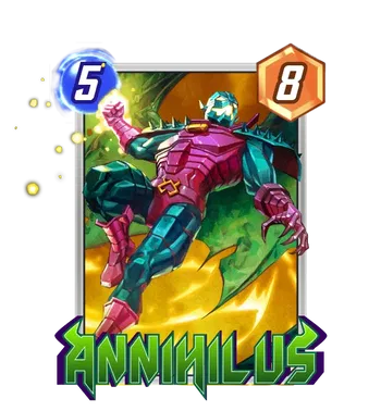
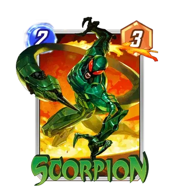
Michael Ivan’s got two pieces this round, and they’re quite the bangers— between some head-turning painted realism on the both of them and a diabolically cool Scorpion design in particular, I’m moved to make a comparison to Alex Ross’ art, in all its painterly glory. I don’t do that lightly, either! Something about the terrific lighting in particular make these a career highlight for Ivan, joining his Alioth as must-haves for enjoyers of any of these cards. Seriously, this has suddenly probably become Scorpion’s best variant.
Adi Granov
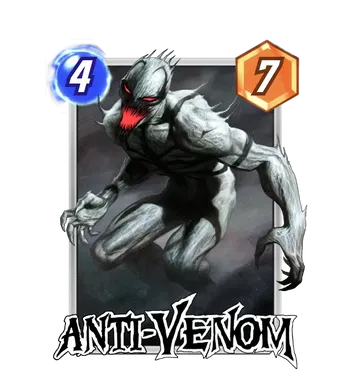
We’re continuing with heavy-hitter after heavy hitter, but I think this piece deserves special attention. Adi Granov is another heavy hitter that seems to have been directly tapped for SNAP— a cursory search shows that this Anti-Venom was painted around 5 months ago, and (while I might be mistaken) I wasn’t able to find a corresponding cover for it. And if it’s true that it was a Second Dinner commission, it’s a huge get! Anti-Venom is a rare character that’s visually striking but underrepresented in existing art, and so any chance for a commission to reach comic cover levels of quality via an incredible Marvel veteran really does just elevate this game. I love the spindly menace that Anti-Venom has hunched over here, and it’s got Granov’s relentlessly rendered style giving his anti-symbiote skin wonderfully alien texture. This variant might be the talk of the town because it’s currently datamined to be a very high value gold bundle, but it deserves the conversation on the merit of its art all by itself.
Ben Harvey
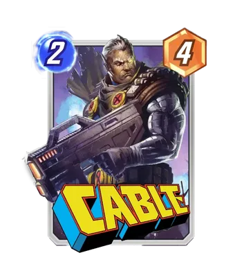
Speaking of huge gets— I think Ben Harvey is one of my favorite comic artists I’ve discovered in the past five or six years, and it’s been sick to see him become a bigger name in Marvel. And so seeing a Second Dinner commission for him excites me the same way Granov’s commission does— he’s got a great painted style that’s got some more energy to it than a lot of other painted pieces. Part of that comes from his lighting; it’s just really solid usage of light to vary the piece, and it elevates what should be a regular depiction of Cable with a big gun to… a really great looking Cable with a big gun. I think he’s got a really great catalogue of existing work, and Second Dinner is cited as one of his artist credits on social media, and so I’m seriously hoping there’s going to be more Ben Harvey in SNAP’s future, both original and from existing covers.
Sweeney Boo
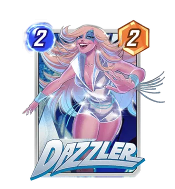
Sweeney Boo continues a steady presence in SNAP, this time with a Conquest variant for Marvel’s biggest pop star. Sweeney Boo’s had a good run of variants in game so far (and I’ve mentioned before I’m a fan of the artist beyond this game) but I do think Dazzler is finally a really big match for her style— a sweet and glamorous character that can really carry the beaming energy Sweeney Boo likes to swing for. This might become my favorite piece of hers, and it’s going to be great to get for free— Dazzler’s already great roster of variants is getting new competition.
Nicoletta Baldari
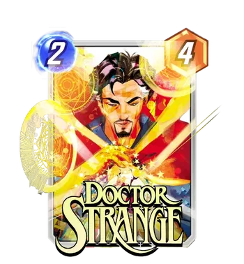
We’ve got a surprisingly high-detail Doctor Strange from Baldari, who’s known for having a simplified, children’s book type illustration style. And while that style is gorgeous (literally none of what I just said should be taken as negative), it’s cool to see Baldari work in a slightly more realism-adjacent space, giving us the varied skin tones that help bring Stephen here to life past flat colors. Her penchant for bringing out the magic in brilliant colors is still at work here: Stephen Strange is doing appropriately Stephen Strange things with an iconic golden glow. Overall, it’s a really great piece that branches out from Baldari’s current niche in game, and something I’d be happy to see more of.
Dan Hipp
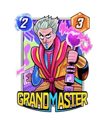
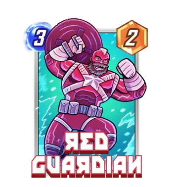
One thing I may have mentioned before but maybe goes unsaid by many Dan Hipp fans is his ability to find interesting hooks to reference about these characters from the movies; perhaps it’s because it’s abundantly clear that he understands the power and appeal of the source comics already, but Dan Hipp borrowing from the MCU feels like so much more than a soulless ‘line ‘em up with the movies’ piece that we see so often in the wake of a movie. He’s given us a smug Jeff Goldblum Grandmaster and a boisterous David Harbour Red Guardian here, and in place of clumsy over-emphasized celebrity likeness he gives us both the slightly more textured layers of a live-action costume and the abundant personalities of both. It’s a great way to vary what we’ve seen in game so far from both characters. What else can I say? Dan the man has done it again.
Nikola Čižmešija
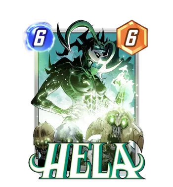
Another great piece from a great SNAP veteran, Čižmešija continues to give us more standalone variants beyond his original Spidey villain series, which means that we will in fact likely see him as a continued ‘evergreen’ type artist for the game. And that’s just great to see: he’s got a talent for finding and focusing on what’s cool about a character, from Silver Samurai’s clean Kurosawa-slice pose to Green Goblin poised on his glider. And here, we see Hela actually alongside the dead she commands— something surprisingly many variants omit, focusing instead on her eye-catching Kirby headdress. But Čižmešija has his cake and eats it too there, spotlighting as part of her imposing stature in the background as a draugr rises to serve in the spectral green of the foreground. It’s sick!
Brett Bean
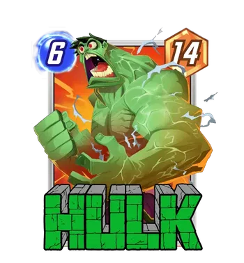
Brett Bean was one of the more fun and interesting newcomers last patch, and it’s super welcome to see another piece from him, this time casting none other than the Incredible Hulk in a zany, kooky light. He’s screaming (and vascular), but rather than it being conventionally cool, or even horrifying, its misshapen and fun— like a father’s just stubbed his toe on the mother of all corner tables. But the expression— the size of his mouth, the wild look in his eyes, the proportions, all feel like a critical mass of cartoony greatness that make this a real treat for the game. Here’s to more Bean in SNAP!
Eduardo Mello (with Studio Grafit)
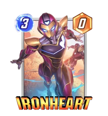
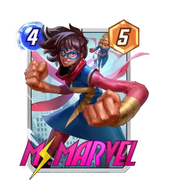
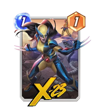
I told you that Mello got to flex a bit more than usual this go-around, and it’s with the help of Studio Grafit in place of his usual partner in crime! Studio Grafit, if you’ll remember from last time, acted as the colorist for Ludo Lullabi on an Abomination variant, which made me wonder if we’d see more hybrid collaboration between individual artists and studios (or at least more individual credit given). This seems to support that, with Mello working together to put out a different style of variant that’s a bit more elevated than his usual fare thanks to the fresh new colors. My personal favorite is Kamala, who is just spoiled for great variants already, but both Ironheart and X-23 are cool and cinematic as well. These still probably aren’t topping any lists of mine, but it’s wonderful to see Mello break out of his role in the SNAP base style.
Flaviano Armentaro
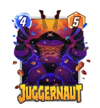
Flaviano, another fan-favorite, returns to draw Juggernaut, another fan-favorite! Juggernaut invites pure scale and power whenever an artist draws him, and Flaviano doesn’t disappoint. Marko’s iconic domed silhouette is front and center here, facing the hint of Wolverine’s claws, and something about the perspective alongside Flaviano’s flair for moody, dark shadows with surprisingly vibrant (if dark) colors, really supercharges the drama of the whole composition. Fans of Flaviano or fans of Juggernaut, look out for this one!
Lee Woo-Chul
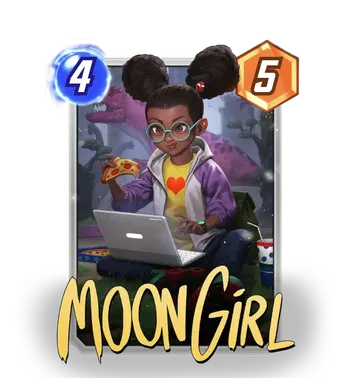
Lee Woo-Chul’s got a Moon Girl coming out, and while I don’t think it’s nearly as eye-popping as some of his existing work in the game, it’s still a perfectly competent piece a player should be happy to find in their collection. I think that, partly because of their position in SNAP’s Series 1, cards like Moon Girl get an outsize number of variants entered in the game, and it’s interesting because that obviously doesn’t always line up with what’s most popular at high level play in Series 3 and beyond. That said, this definitely is in the upper half of that abundance of variants, and it’s always fun to see more art for Lunella.
Alex Horley
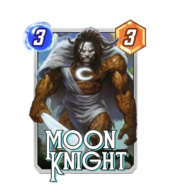
Horley’s back, this time continuing his longstanding series (turned upcoming season in March, shh!) of prehistoric Marvel, we’re getting a sneak peak at the March season theme drawing from Marvel’s Avengers 1 Million BC arc (by Jason Aaron, if you’re interested in more). Among the ancient roster is this particular Moon Knight, the First Fist of Khonshu, a caveman imbued and cursed with the Moon God’s power. This is the best that caveman has ever looked, in Horley’s extravagantly painted fantasy-adventure paperback style— I really like how perfectly Horley’s work matches up with the prehistoric theme. This Moon Knight seems slated to be the exclusive reward for SNAP’s hot-off-the-presses Super Premium pass, too, so only the most dedicated members of the Midnight Mission might find themselves with the First Fist— but be on the lookout for more Horley, as we get closer to March.
Marcelo Vignali (with Mooncolony)
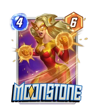
Last but not least (but maybe not most), Marcelo Vignali’s back in tandem with Mooncolony to, perhaps extra appropriately, give us a swing at Moonstone, who will be coming up in the January Dark Avengers season. Vignali had a variant with Mooncolony earlier (and was in fact one of the first times we’d seen an individual artist credited alongside a studio’s coloring) and this continues that trend, signalling something we’ll likely see more of while also just reprising Vignali’s fun, broadly appealing and stylized art. Moonstone is one of those characters who, for the average reader, just wears tights and shoots beams, but she’s had a few costume changes over the years, and while we’ll likely see her in her Captain Marvel duds from her stint on the Dark Avengers (and her base seems to be her more common, modern look), it’s nice for Vignali to hearken back to her more hawkish mask and red/orange color scheme. It’s well done and fun, and while composition-wise it’s nothing to write home about, variants that explore a character’s oft-long history of costume changes are always welcome.
New Commissioned Artists!
James Ryman
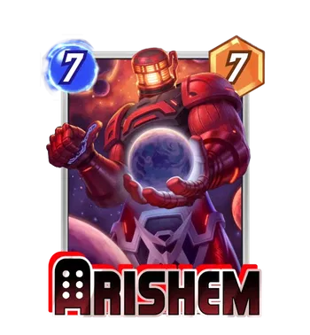
As we move onto new artists, James Ryman feels cut from a similar cloth as Vignali’s right above: there’s a similar generally stylized, almost bubbly appeal to the way he’s rendered Arishem, and it reminds me of art from games like Hearthstone. Now, in the above’s case, I think a lot of that comes from the studio’s coloring: Mooncolony has in fact explicitly done art before for Hearthstone! And so has Ryman, which basically makes everything I just said make sense. (Did I Google in between sentences? 100%.) But that pedigree isn’t a bad thing: Hearthstone’s light, fun art was a big draw for the game, and it’s nice to see some of that energy ported over in an authentic way to Marvel’s SNAP’s most beloved card Arishem. (Right?)
Cameron Stewart and Konstantin Turovec
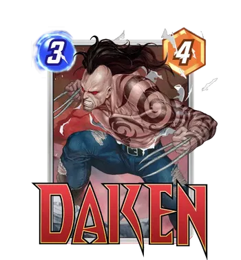
We’ve got a lineart/color collaboration again, this time between two names new to SNAP— comic artist Cameron Stewart, and game artist Konstantin Turovec. The Hearthstone pedigree continues with the latter (maybe Ben Brode’s tapping some old connects?), which is fun, and it’s also cool seeing another comics name make the jump to SNAP. Cards on the table, I was scouring the internet because this felt so much like it’d be from an existing comic, but couldn’t find it— if this was a commission, it did a good job feeling authentic, down to Daken’s ridiculous mohawk. I’m a bit more partial to Stewart’s line art than I am to Turovec’s colors here, but I’m happy to see more of them in the game, and I hope we do.
Nao Fuji
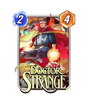
Nao Fuji is a new name that brings us yet another anime-inspired style, this time bringing it to Doctor Strange and bringing with it a background menagerie of very cute pets (including a cameo from none other than Bats the Ghost Dog!) And while I’m not always particularly interested in the array of anime-inspired styles, I think that there’s a great variety within them, with Fuji landing on a very dramatic depiction that conveys Strange’s Supreme Sorcerous power… next to, again, very cute animals like Goose and Bats. It’s a lot of points for the pets on this one for me, but if you hunger for more anime in SNAP, this will be up your alley.
Jongsup Kim (with Mooncolony Studio)
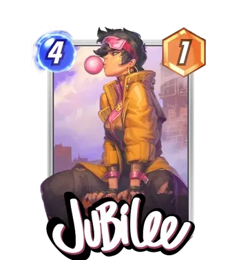
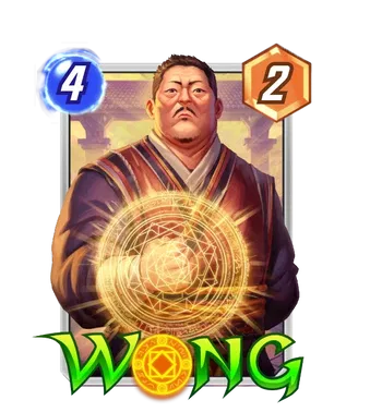
Finally, Jongsup Kim also teams up with Mooncolony for a pair of great variants for Jubilee and Wong! I always appreciate when a line artist’s style shines even through a different colorist, and I think Kim’s debut here does exactly that, with a really fun stylization for both Jubes’ and Wong’s faces in particular. Jubilee’s my fave, of the two; I love the perspective looking up at Jubilee in profile blowing a Cool Bubblegum Bubble. But they’re both great, and hopefully a good sign for future artist-studio collabs to come!
Pulled Straight From The Stands!
Kael Ngu’s Venom (2018) #29 Variant Cover
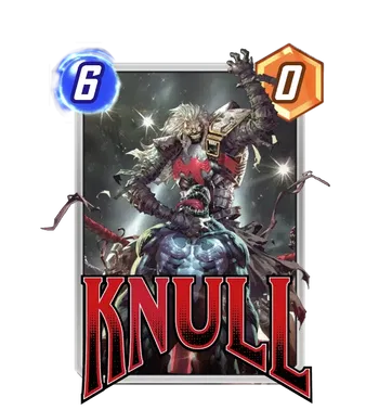
Look, you know this is often my favorite part of the article; it’s no secret. But this time around, this is my favorite part of my favorite part of the article: when a comic cover is so great that when people see it think, “wow that’s great,” and you’re like BOOM it’s from the comics! You might recognize Kael Ngu’s Venom from his oft-celebrated championship belt variant— that is, the cover to Venom (2018) #28. But his variant for #29 follows up when the King in Black shows up to give our favorite terrible twosome the business! Seeing a grimdark “biggest bad of all” fighting Eddie for the championship belt is the perfect combination of genuine compelling gravity and dumb comics levity, and it all comes together with Ngu’s incredibly detailed rendering and lighting. This piece is a blast, and a standout among Knull’s many, many existing variants from variant covers— which is no small feat.
Mark Brooks’ Araña: Heart Of The Spider (2005) #1 Cover
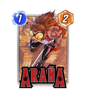
Mark Brooks has a recognizable detailed, highly rendered ‘realistic’ style he often uses in comic covers, but this earlier piece predates a lot of his current work, and in a way that makes this back-issue pull even more authentic feeling: like a piece of 2000s history. Araña predates a lot of current comics people might be familiar with, giving us a scrappy Spider heroine long before Gwen Stacy got a second chance in the white-and-pink. And this cover from #1 of her flagship series captures a lot of that scrappy Spidey energy, with a really dynamic pose, a quite-2000’s costume, and the dramatic reflection of the New York skyline in her lenses and the background. It’s a great pull for a card variant in SNAP, and a great reminder that one of the less-known Spider-characters has been around for quite a while.
John Romita Jr.’s Eternals (2006) #2 Variant Cover
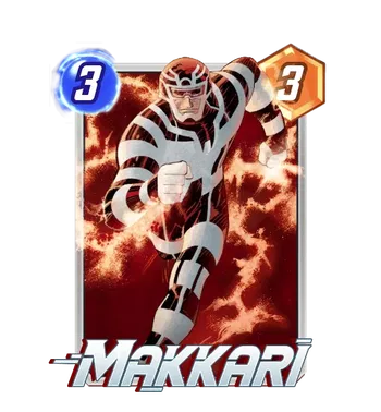
Talking about throwbacks— Makkari gets a classic comics version, using John Romita Jr.’s variant cover for the 2006 Eternals series written by Neil Gaiman. And people might be quick to remind you that Makkari wasn’t a deaf black woman in the comics. And they’d be right; as wonderful as Lauren Ridloff’s Makkari depiction was in Eternals (frankly, a high of the whole film) the character was, like many of the Eternals, a white dude in a comparatively goofier costume. So for comics purists, this variant goes out to you. (You might actually recognize this Makkari variant as a placeholder that was in snap.fan datamines for a long time before her current base was released.) And honestly? While I’m sometimes critical of JRJr.’s more static work in comics, this feels like a really solid piece the longer I look at it. He’s running, with energy curling around him, and while it’s not necessarily the most hyper-dynamic run you’ve seen (players might be spoiled by the likes of Kim Jacinto) I think there’s a stately energy to it befitting Marvel’s strange, mythical superpeople.
Peach Momoko’s Ms. Marvel: The New Mutant (2023) #3 Variant Cover
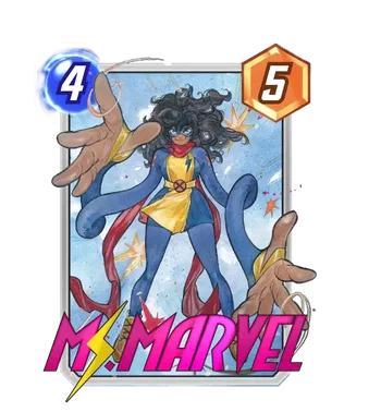
Peach Momoko? Check. Ms. Marvel? Check. Variant from the comics? Check, check, check. Odds are high that this variant is gonna be great, and— oh, hey would you look at that.
Look, what’s more to say? Kamala’s massive popularity, combined with fun powers and a great design, means that she’s just going to inspire artists to come up with some really great pieces, and Peach Momoko’s flowy, fluid art style works well with Kamala’s winding arms and reaching fingers. Folks might still be skeptical about Kamala as a mutant, now, but the new series and exposure has led to some really, really great art coming out for her right now, and seeing some of that come to SNAP is wonderful.
Leinil Francis Yu’s X-Men (2019) #20 Cover
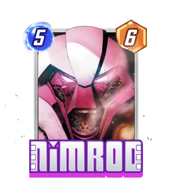
Another veteran, Leinil Francis Yu gives us this relatively recent X-Men cover for the coolest genocidal android on the block, Nimrod. (Ultron can call for a recount next time a variant of his comes around). There’s something interesting about seeing an artist explore the textures for the strange pink body that Nimrod has, let alone the expressions the Sentinel is capable of, and so seeing an up close portrait screaming with seared circuitry is an interesting perspective on the character. For anyone particularly interested in portraits as variants, this cover joins a pretty exclusive club— and for any fans of Nimrod, it’s definitely a great, more interesting piece to pick up if you’re tired of his current slim offerings. Leinil Francis Yu does good comics; who knew?
InHyuk Lee’s Immortal Hulk (2018) #21 Red Hulk Variant Cover
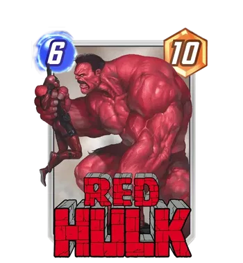
IMMORTAL HULK MENTIONED RAHHH WHAT THE !$#@% IS A BAD HULK VARIANT
Sorry, I blacked out for a second, not sure what that was. But this is so exciting, on a personal level! Al Ewing’s Immortal Hulk is one of my favorite comics, ever, and there’s a veritable wealth of variant covers from that run that would absolute rule in SNAP. This Red Hulk by InHyuk Lee is actually a recolor of a variant from the same issue with regular ol’ green Hulk handling poor Wade.
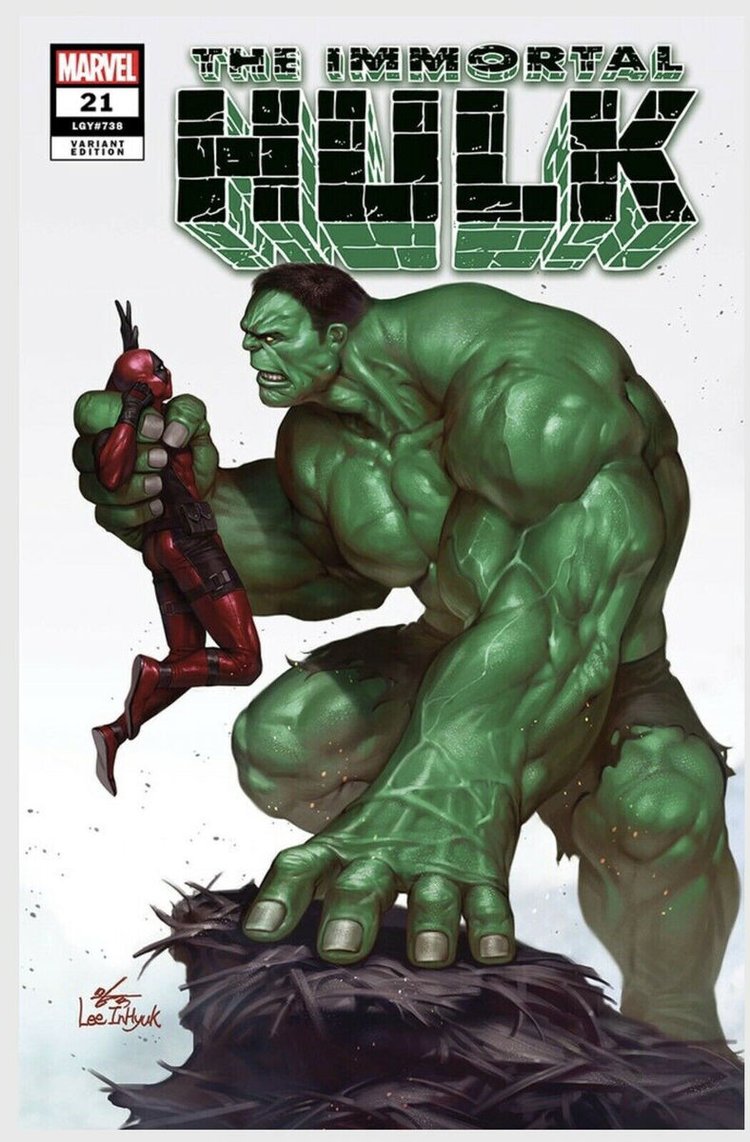
And fans of the big guy might feel a bit slighted that the variant went to Thunderbolt Ross after all, but hopefully this is a sign that we might see more variants from Immortal Hulk down the line— many of which spotlight the jolly green giant plenty. Mostly, red or green, I love the scale that we get, from Hulk’s monstrous frame perched menacingly as he is, to Wade, being provided basically for scale (and maybe to explain what could have ticked off a Hulk in such a short period of time.) It’s probably one of my favorite InHyuk Lee pieces coming to the game, as of now.
Staple Studio Work
Wild Blue
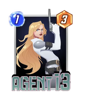
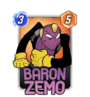
Last leg, guys! We’re at the studio section, and like before I’m going to start with the tried and true studios we’ve known Second Dinner to tap. Wild Blue has two wildly different variants here, reminding us that, as much as studios might be tapped for variants en masse, they can also fill out specific series, adapting to a specific style or aesthetic prompt. Agent 13 has a cool stark white spy jumpsuit going on, which actually probably elevates this variant to one of her better ones purely by virtue of Agent 13 not having the most to work with (existing art-wise and design-wise). But the star here is a Toon World Baron Zemo, following in the footsteps of Toon World Annihilus (from the same studio) and the anniversary Deadpool, done by Eduardo Mello. It’s a really fun series to see continued, and while I don’t think it’s as strong a piece as the Annihilus from last datamine, it’s fun seeing the hint of his cartoonishly evil smile behind his mask.
Creative House Pocket
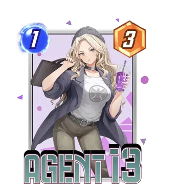
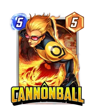
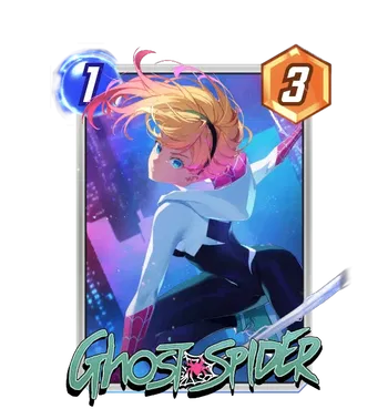
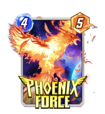
Creative House Pocket comes back around for more, with two overtly anime-stylized variants for Agent 13 and Ghost Spider and two more general (perhaps generic) variants for Cannonball and Phoenix Force. There’s better work for the latter two, and so I’m sure these will mostly feel like variants to fill out two of the more spare variant catalogues; the former two are a bit more interesting as more anime-style art for two characters that lend themselves well to that.
PANDART STUDIO
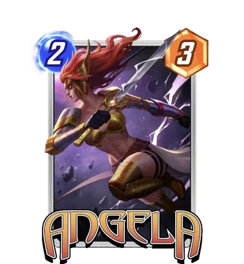
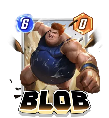
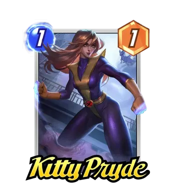
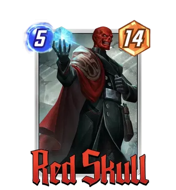
Eternally, we’ve got more PANDARTs arriving to the game, too. Angela is the most dynamic of the bunch, and I do think PANDARTs really are at their best as more dynamic pieces— when there’s more draw to them beyond the generally common sheen of extreme rendering. Blob is similarly dynamic, though it’s not my favorite for him, and Kitty and Red Skull end up on the more static side, forcing those pieces to lean a bit more on the style of the piece. For some, that’ll be enough! PANDARTs are certainly a fan favorite. But there’s plenty more studio work if that isn’t your speed.
Winking Studios
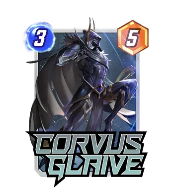
There’s a fun Corvus Glaive here from Winking, and it’s nice because he really does have one of the more starved variant catalogues out of the characters in SNAP, in no small part thanks to a similarly starved catalogue of existing comic art. It doesn’t necessarily compare the best to, say, Seth Adams (who did terrific work with the entire Black Order) but its a dramatic and cinematic piece if anyone is looking for a way to spice up the member of the Black Order who has a glaive and, you know, discards stuff for +1 max energy.
Envar Studio
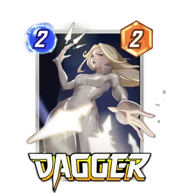
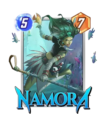
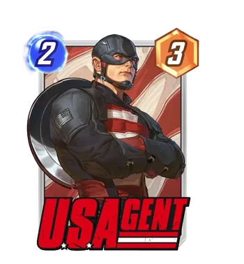
Probably three of the best variants from this batch of studio variants comes from Envar, with solid showings for Dagger, Namora, and USAgent. Dagger doesn’t have a particular paucity of variants, and people have pointed out just how many variants have Dagger spraying out an arc of daggers the same way at the viewer— at which point, to be fair, it’s a quite common pose for someone to draw someone throwing a bunch of stuff. Namora and USAgent, I think, are more likely to have these variants become mainstays for folks.
DIVE Eight Studio
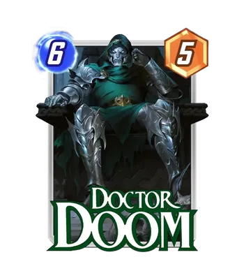
DIVE Eight continues the Ultimate rarity Fantasy series, putting Doctor Doom in a classic ‘ruler in repose’ pose. Now, there’s questions about… how much more Fantasy this piece is, than the regular old Latverian dictator in a green hood and metal suit of armor. But, all in all, it’s just straight up a solid piece from DIVE Eight, and actually probably one of the stronger entries in the Fantasy series as a whole.
Mooncolony
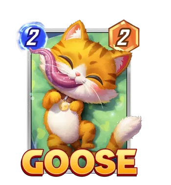
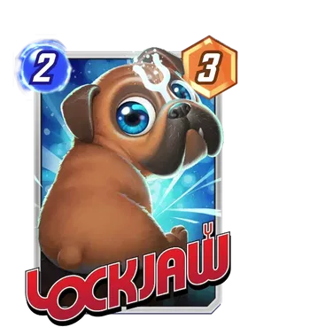
After moonlighting as a colorist studio for much of earlier this article, Mooncolony shows up for two whole pieces— giving us two adorable pets designed with almost scientific cuteness precision. Both are extra rendered, like many variants of this sort, but it’s hard not to give some credit for just how cute these have turned out.
SIXMOREVODKA
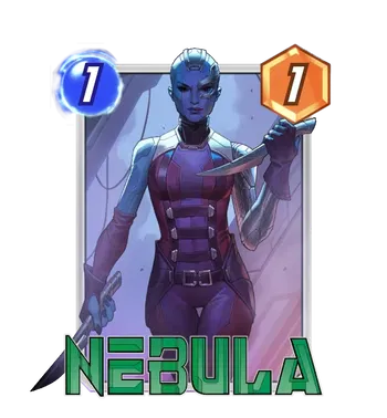
Finally, SIXMOREVODKA returns with Nebula, modeled after the movie with those black eyes. I think the rendering here actually is working to the variant’s advantage, matching the cinematic look that the movies use. She’s not doing more than walking towards the viewer with a knife, but I think it’s a solidly made piece even if it’s not the most groundbreaking composition in the world. It’s a good Nebula!
New Studios
Jelly Pixel?
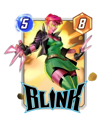
Only one newcomer studio this time around, and… I’m not actually sure if it’s a studio or an individual artist? A very cursory search didn’t yield much (besides literal pixel art of jelly), but either way they’re bringing a heavy forced perspective and dynamism to the composition. It’s reminiscent of the dynamic PANDARTs that are reminiscent of Kim Jacinto; that is, it feels imperfect, but I appreciate what it’s going for well enough. I think the look for Blink is cool (I dig the hair), though basically rooted in the base design we’ve seen in game already. It’s a fine variant, though the mystery surrounding this newcomer is likely more interesting than the piece itself.
Lost Assets?
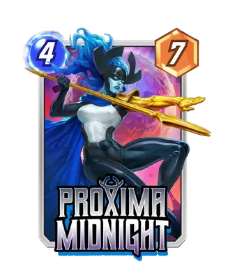
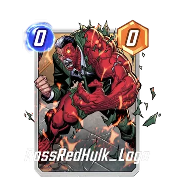
Finally, I’d be remiss if I ignored the missing assets mined as well; as far as Proxima and Scorn are concerned, it’s possible there’s been variants that were pulled, or even that there was just a coding snafu referencing the wrong image. Either way, we’re left with some tantalizing mystery of… well, what these variants might look like. (They’ll likely be custom commissions, because both are quite scarce on the existing art side.) And, well, it looks like this card for Ross Red-Hulking out may have been discarded from a previous Thaddeus Ross design— was there, in fact, a Red Hulk reprint at some point? I’m personally glad there isn’t after all, though I do actually really dig the classic monster grotesquery of Ross turning into Big Red.
Wrapping Up
And that wraps my coverage this bout; there may not quite have been as much as the floodgate-opening that was the November patch, but I’m actually quite excited by a lot of the work this patch gave us. My tops might have to go to Viktor Farro this go around, but what do you think? Did I snub a favorite of yours? Do you disagree vehemently with my entire artistic opinion? I’ll take on any and all challengers in the comments below! So let me know what you think. And as always— thanks for reading. Be on the lookout for more regular variant coverage in the forecast next week!