
The January patch has brought us the customary variant datamine dump— a glorious pile of brand new comic art JPEGs, ready to be meticulously combed through by nerds like me. And I’m glad for it! (Even though every one of these is, frankly, a bit a hustle to get out. Thanks for the patience, y’all!)
But enough about me; we’re getting, among other things, a glimpse into the March season, a peek at a couple of albums, and a cavalcade of original art and back-issue covers. You’re going to get sick of my voice up here if I yap longer, and I need you to be sick of it closer to the end, so let’s just dive in!
Upcoming March Season Showcase: Alex Horley and Fireball Studio
Alex Horley
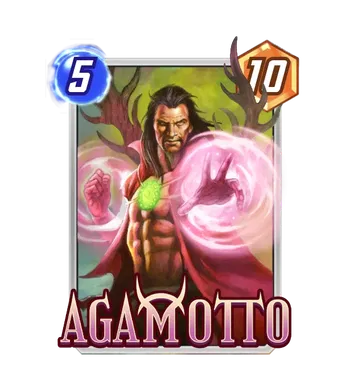
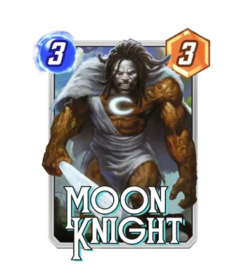
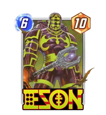
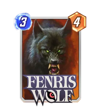
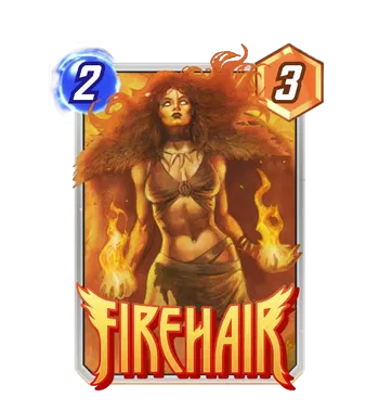
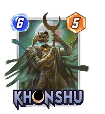
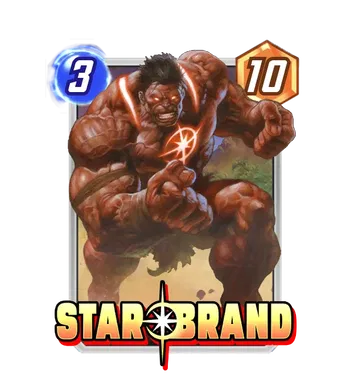
Let’s start off with the big stuff: as next month draws near, the month afterwards becomes clearer, like a crystal ball peering through the fog into the future. And clairvoyant signs point to… Caveman Avengers, baby! Specifically, the primordial, prehistoric Avengers 1,000,000 BC, featuring gods like Agamotto, Khonshu, and Odin, and also early people inhabited by cosmic forces like the Phoenix or the Starbrand. Which is all to say, you’ve got some really cool characters that come together into a shape that resembles Avengers we know and love. But the comics background is one thing; another thing is having those character rendered in the gorgeous, heavy-fantasy stylings of Alex Horley. No artist captures this style of illustration better, and Second Dinner knows it; Horley is the featured Spotlight artist for March, giving each new card a brand new splash of lush, illustrated art straight off a fantasy paperback, or the coolest Magic the Gathering card you’ve ever seen. My favorite of the bunch is probably Khonshu, who really benefits from the aged fantasy look, but they’re all great, and seriously going to make me consider how many extra keys and tokens I’m willing to spend.
Fireball Studio
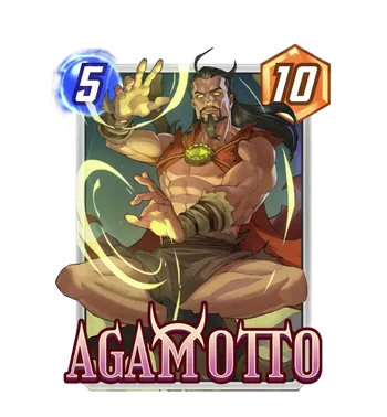
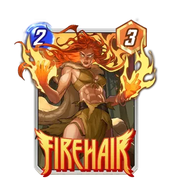
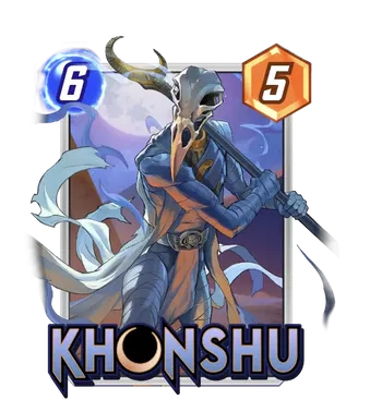
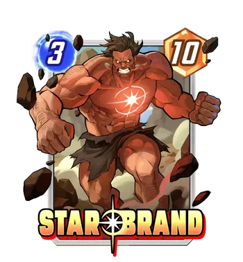
And pulling up the General Pool side of things, Fireball Studio seems to be providing a second variant for all the new cards in March, giving us a more traditionally comics-stylized look for all the BC Avengers. It’s not going to meet the same level of artistic achievement as Horley, but Firebal is a competent studio that gives us a dynamic, more simplified alternative look for these characters— and more accessibly, in the General Pool. Either way, it was an early but consistent criticism that new cards were only launching with a single variant in the Spotlight, and so it’s good to see Second Dinner now consistently get at least a couple of artists to handle the season’s duties.
Dinosaurs Make Everything Better
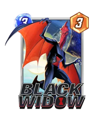
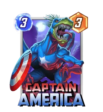
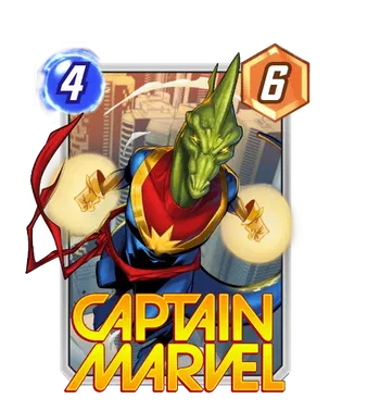
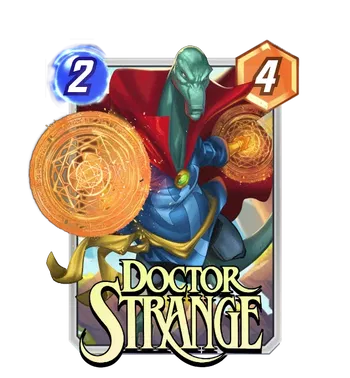
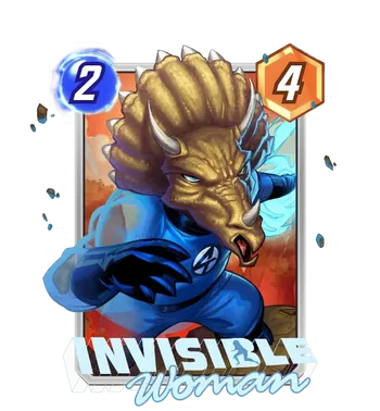
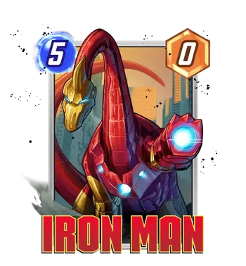
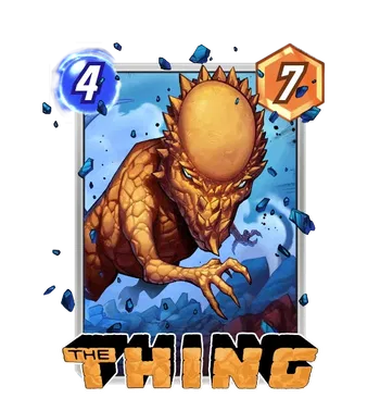
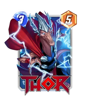
It’s true; I $#@!ing love dinosaurs! And I know that these are going be divisive already, because they’re also $#@!ing dumb and ridiculous. And I love $#@!ing dumb and ridiculous! These variants are actually sourced directly from a relatively recent moment in the current Fantastic Four run (written by the wonderful Ryan North) where the Fantastic Four is transported to a world where everything is the same except everyone is dinosaurs.
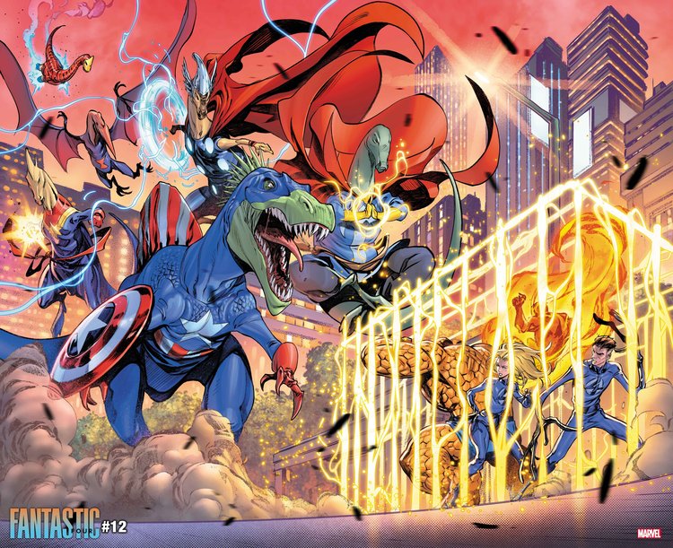
Fantastic Four (2021) #12, art by Iban Coello
It’s great. Truly. And it’s an impressive shift for Eduardo Mello, Ryan Kinnaird, and Luca Pinelli, who make a real departure from the SNAP house style yet again, with a different kind of rendering that helps set this apart from a lot of the other gag-style variants we often get from this team— to the point I even wonder if there’s maybe a line-error in the datamine misattributing Kinnaird! But maybe that’s not fair— all commissions are done to specification, and artists are quite much more versatile than the limited style we see from them. Either way, in my opinion? The insanity is pushed to 110%, which makes this top the last round of Animal Avengers we’ve seen.
Creees’ Prehistoric Team-Up!
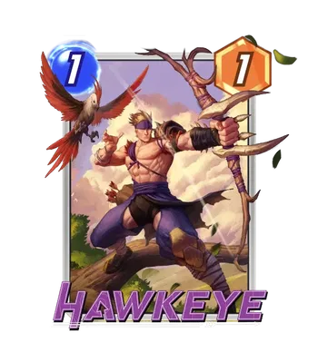
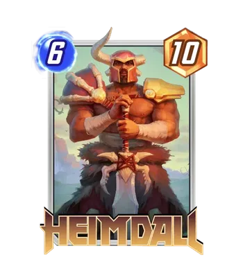
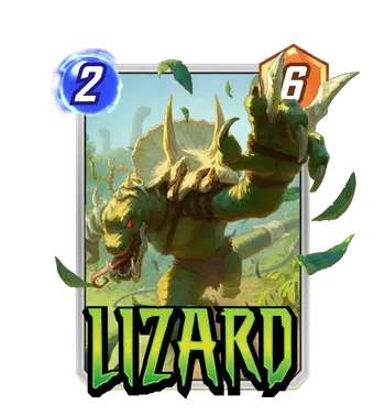
Continuing with the BC theme, we’re getting prehistoric takes on modern Marvel characters as well, with all the lineart done by recent SNAP addition Creees! Now, similar to above, these are a huge step away from the house-adjacent style that Creees has contributed to SNAP so far; much of that can be attributed to 3 out of 4 of these being colored by Mooncolony, who are known for a soft, almost 3-dimensional style of rendering that hearkens back to their work on Hearthstone. But the 4th of these, Hawkeye, is apparently colored by Kinnaird: again, a huge departure. Now there’s more signs this time pointing to this being an actual error, not because I doubt Kinnaird versatility but because Hawkeye feels colored and shaded exactly like the other 3 done by Mooncolony. But who knows? It’s hard to make assumptions, and I don’t want to take credit away from somebody before I know for sure. Either way, these are a fun way to help fill out content in the theme for the March season.
Envar Studio’s Big Month!
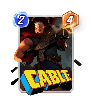
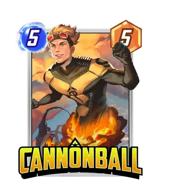
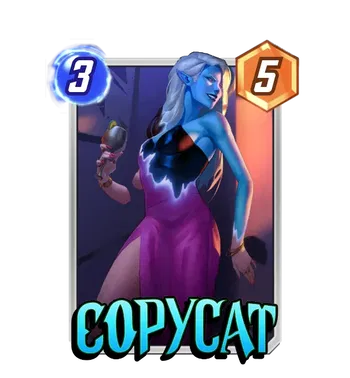
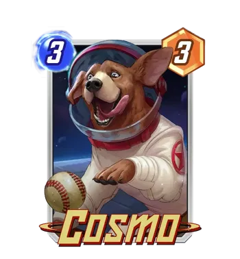
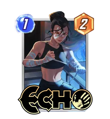
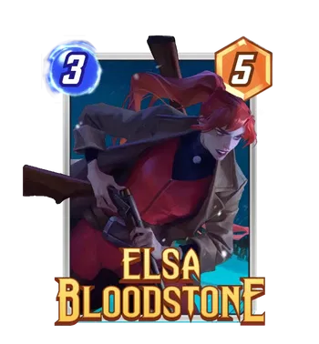
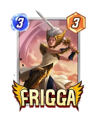
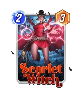
In non-unga bunga news, Envar Studio (a relative new kid on the block in SNAP) comes through with its own big takeover and album: one similar to the PANDART takeovers, all those months ago. There’s even going to be an album!
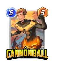
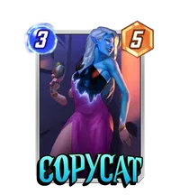
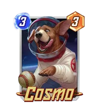
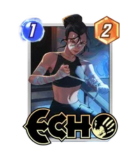
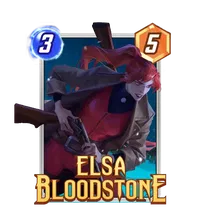
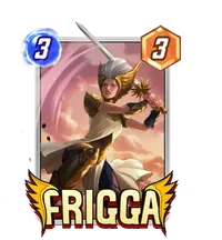
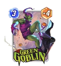

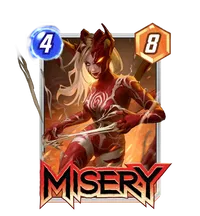
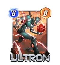
They’re hitting all sorts of corners of SNAP’s Marvel universe too, meaning that these aren’t meant to be themed beyond being Envar’s take on all of these characters. (Note that a handful of these datamines won’t be in the album, though they’ll likely be in another Envar album soon enough.) And as a certified studio skeptic, I’ll be the first to admit that a good deal of these look terrific. Cosmo is a frontrunner, with some really impressive texture work to bring the best boy to life and a wonderful baseball to boot; the shadows on Elsa as she ventures into the night to presumably shoot monsters also make hers a favorite of mine. Cable is another favorite of mine (love that red scarf), and it’s not even in the album! And like many of these studio takeovers, even the ones I’m less crazy about are at a baseline level of competency, and anybody who wants a simplified, stylized variant unified under a certain look will enjoy these. Bonus points: this batch seems to be breaking away from the pseudo-real, glossy sort of rendering, differentiating all of it from much of the other studio work in SNAP right now.
John Tyler Christopher’s Negative Space Covers
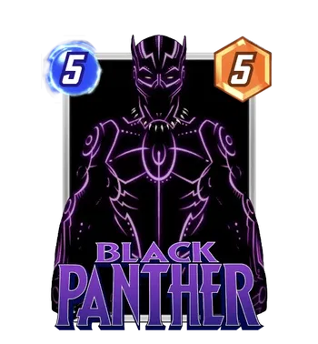
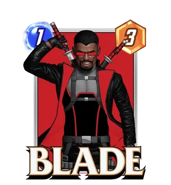
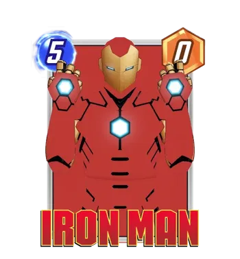
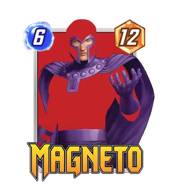
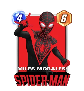
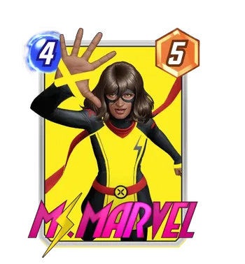
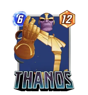
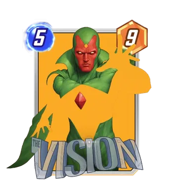
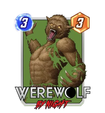
The other big series and album we’ve got sight of thanks to this patch is a run from John Tyler Christopher’s series of Negative Space covers— a classic series of variant covers JTC has done for the comics for quite some time now, and one that I’ve been asking about for ages. (Seriously! Check all of them out sometime.) The visual premise is striking, it takes advantage of these characters having such clear palettes in their costumes, and the covers are also all very, very well illustrated versions of these characters as a baseline to boot! My favorites out of these might have to be Black Panther or Iron Man, but they all look great, and I might just get the most mileage out of Miles (who I’ve been hunting for a good variant for forever).
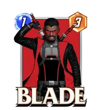
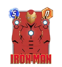
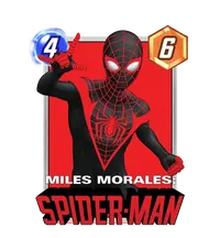
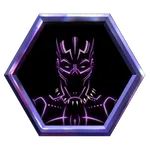
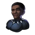
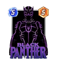
The Black Panther is the reward for the album, which means it’ll only be achievable for folks willing to drop gold for the entire set, but this brings up the other mindboggler— all of these variants are only 700 gold! An album has rarely looked more collectible, and I for one will be hard pressed to find reason not to chase these down for the reward variant. The only question mark: how will these split? Snap.Fan has approximations of how cards will split, which (when tested with these) suggests a disappointing lack of interaction with the background in the ‘negative space’ of these figures (they get cut out, and the background has the gold/prismatic filter just placed over it).
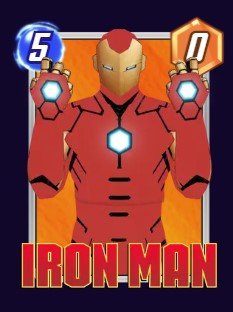
But that’s not official, and it’s still possible Second Dinner puts extra work into making these pop with background splitting— can you imagine the negative space actually merging with the background of your favorite splits? At the very least, it’d be cool to see. But who knows? Either way, expect these to make waves. In my collection, that is. Because I’m getting them.
Other Returning Favorites!
Erica D’Urso
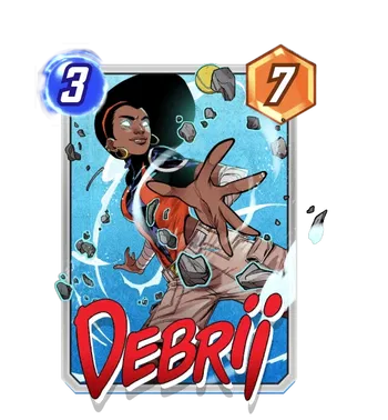
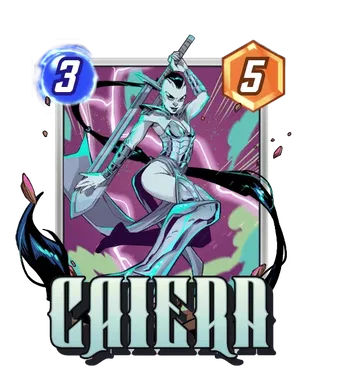
After debuting her America Chavez in the Conquest Shop in December, Erica D’Urso is back with another Conquest variant— this time for Debrii, one of those characters who’s quite obscure in the comics but iconic in SNAP. It’s great to see any variants for her because of that obscurity, but D’Urso has really given Debrii a dynamic treatment, with a cool pose and composition tilted appropriately to match a whirlwind of… well, debris. There’s a Caiera as well, which is a bit less dynamic as a piece but welcome for many of the same reasons: there are some covers out there for Caiera, but for how many players know her now in SNAP, that catalog needs to be bolstered. I love the colors of the background, on that piece; between the purple and the lightning, it provides a cool interaction with all the reflective surfaces on Caiera’s armor.
Iban Coello
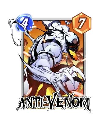
Iban Coello continues his return from drawing symbiotes in the comics to drawing symbiotes for SNAP, and it’s always a pleasure to see—there’s big buzz surrounding the Anti-Venom Gold Bundle slated for a little later on purely based on value, but, for what it’s worth, Anti-Venom also just doesn’t have a ton of existing art to go for— even as long as he’s been around and how striking of a character is. Coello’s got a sleek, dynamic style perfect for SNAP (on top of his excellent comics pedigree, and so having him bolster Anti-Venom’s general pool of variants is a win.
Dan Hipp
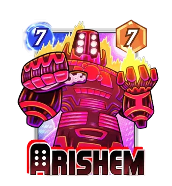
Dan the Man Hipp is back, steadily continuing his evergreen presence in SNAP one or two variants at a time, and this time around he tackles the big guy Arishem himself. Like most depictions of Arishem, his big ol’ cosmic thumb is on full display, mid-judgment, but the most fun thing about is how Hipp manages to capture Arishem’s scale even through his cartoony style—the simplified forced perspective angled up at him ensures that even like as fun as he looks, he’s still a proper whole Celestial. Terrific!
Justin Fields
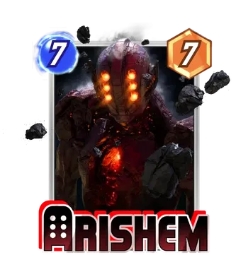
Arishem gets the twofer, too, with Justin Fields returning as one of SNAP’s exclusive-to-bundles artists. Fields’ dark, heavily rendered sci-fi style is a great fit for that, for what it’s worth; I’ve always said that art is subjective and variant pricing is completely arbitrary, and the biggest compass for what costs gold versus cash is just what traits feel valuable to people. And Fields has that in spades! But I can only hide from the cynical veneer of artistic valuation for so long, before I also admit— he’s a great artist, and as far as artists that carry those feels-valuable traits goes, he’s created some genuinely great art that manages to at least match an exorbitant price on a bundle. I love composing the piece around a Celestial like Arishem being this hulk of a derelict space monolith, glowing that brutal red in the dark. Bundle enjoyers, consider heavily; as for the rest of us, the Vault is going to have a tempting new addition in a year!
Max Grecke
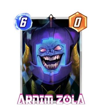
But it’s a balance, and for every great variant that costs bundles of cash, there’s a great variant that costs a paltry 700 gold! Max Grecke’s a veteran of the variant game who’s also no stranger to being priced for the people: his Arnim Zola joins the ranks of his many variants that are 700 gold and the fewer that are 1200— but achievable in the General Pool all the same. I love the way Zola’s face feels almost like it’s trying to burst out of the screen Grudge style, the ominous classic top-camera looming like a cyclops, and the color and lighting giving the entire piece a deranged sort of menace. Zola’s cackle is great in many of his variants, but this one is simply top tier.
Vincenzo Riccardi
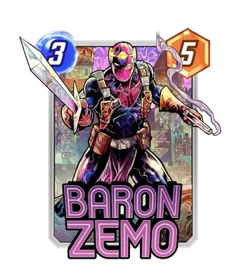
Riccardi’s back with another kaleidoscopic rainbow color scheme for a classic character, draping Zemo’s iconic purple in his distinct color-bomb lighting that brings the entire piece to life. The shadow on Zemo’s mask is a nice darker contrast to an otherwise bright variant, and that the pose fits traitorous royalty not afraid to get his hands dirty. Riccardi’s catalogue in the game basically started strong (I feel like he’s got an enormous amount of variants in the game released in a very short period of time) but Zemo is in spotlights soon, meaning there may be renewed interest in another variant for the Mill staple himself.
James Ryman
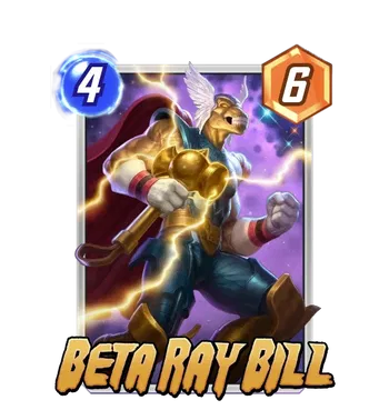
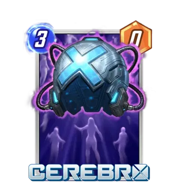
James Ryman is back, with what feels like a cross between recent Mooncolony-colored variants’ friendly, bubbly style and the edgier, dramatic compositions and detail of PANDART variants— both Beta Ray Bill and Cerebro are rendered with a particular kind of roundness to the lighting that makes me think of both of those studios. Bill occupies the latter part of that spectrum, with his bulging biceps and lighting coming off of Stormbreaker, while Cerebro’s (understandably) less combative composition compensates with the classic floating psyches it detects. Did I honestly, genuinely think that Cerebro was floating over the silhouette of some sort of disco? Absolutely. But if you enjoy these, keep a lookout!
Rian Gonzales
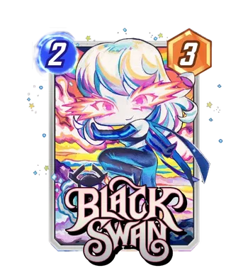
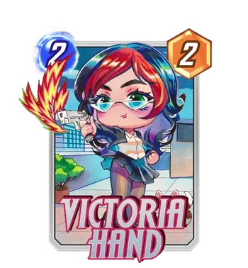
Rian Gonzlaes is back as well, and as a someone who rarely engages with the chibi side of anything in my own interests, I have to admit that this Black Swan is very cute! Something about the haircut and the power-glow around her eyes is making this chibi click, and that’s on top of all the standard praise for Gonzales’ light-washed, watercolor-feeling style that elevates her above other Chibis. (If you’d told me Black Swan was a character with a burgeoning catalogue of strong variants a year ago, I’d have thought you were crazy). Victoria Hand is fun too, amusingly firing a literal gun while clutching a clipboard in the other hand. There’s plenty of character to it, with something especially funny about realistic firearm having such a stylized ‘gunfire’ effect coming off it. Gonzales fans rejoice; she’s not going anywhere!
Nikola Čižmešija
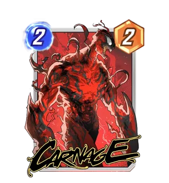
Čižmešija is here with a real treat this round, giving us a truly sick looking Carnage lurching forward like a proper alien horror. It’s a return to Spidey villains for Čižmešija, and it feels like an especially cool, detailed piece from someone whose style sometimes is defined by a smart level of streamlined simplification. Between the lighting from below and the tendrils curling off of him, the step up in detail pays off, making this one of the coolest pieces for an artist with such a cool baseline stable of work.
Sean Galloway
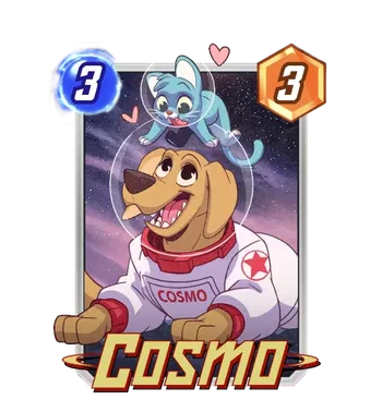
It’s a different vibe but an equally immaculate one nonetheless next, with this sweet little Cosmo and friend from Sean Galloway. I’m specifically an enormous fan of Sean Galloway, but any artist that really broadens the range of art styles we see in SNAP is giant win; seeing not only a cartoon-inspired style, but also seeing it executed well (with distinctly different-feeling textures and colors to boot) is a joy. For many folks, a cute cartoon Cosmo with a little blue cat buddy is enough; for the more discerning eye… it’s a really, really good cute cartoon Cosmo with a little blue cat buddy. What can I say; sometimes, the many folks have it.
Don Aguillo
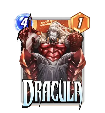
Don Aguillo is back, this time giving us a Dracula variant slated for the Rare pool. Lounging in dark repose like any supervillain with a chair worth its salt, this is a fun take on Marvel’s Dracula. Aguillo adheres pretty closely to the standard Marvel Dracula, with his blood-red battle armor, and so there aren’t any design surprises necessarily, but it’s worth commending just how hefty the composition makes this armored Dracula look— with the perspective where it is, he feels like he’s pressing up against the sides of the frame and then some, giving the character a sense of gravity and scale.
Junggeun Yoon
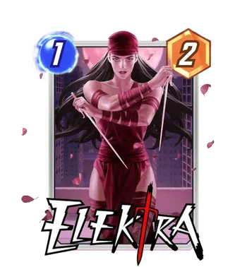
Junggeun Yoon debuted a SNAP original commission not too long ago, and he’s back for more here with this Elektra. It’s worth mentioning that he’s got plenty of background drawing Elektra on covers for Marvel already, and his piece here feels right up that same alley— she’s got her classic costume rendered in some very nice light-red lighting that’s also complemented by the flower petals flying around. Yoon has a good grasp on how light and color help sell the mood of a piece, and so a relatively benign pose like Elektra’s here gains some edge from it.
He Tianyou
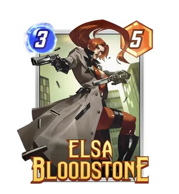
He Tianyou’s also getting more work in SNAP; this will be coming after his big spotlight week in February, and it’s good to see his work coming so soon after. It’s a strong reprise too, with Elsa’s flowing hair, trenchcoat, and bullet casings coming together in a very dynamic composition. The sharp angles and clear planes make the shadow on the piece feel very striking, lending the entire thing a noirish tint that makes perfect sense for your favorite Marvel monster hunter and lands it among my favorite variants for Elsa!
Bengal
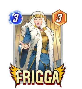
Bengal is another artist whose previous work in SNAP comes from back-catalog pulls (specifically, Ghost-Spider 2099) but seems to have been folded into SNAP’s commission rotation! They’ve got a great style about them, with solid line and colorwork backing it up— I love Frigga’s face especially, feeling distinctive as the face of Nordic royalty and bucking the trend of same-face that often plagues comics in general, let alone Marvel SNAP! It’s especially good to see a great piece for Frigga too, who could use all the commissioned art she can get.
Marco Failla (and Luca Pinelli)
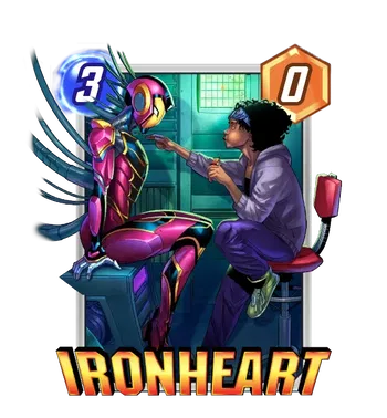
Marco Failla and Luca Pinelli reunite for a nicely composed variant that gives us both Riri and the Ironheart armor in one shot. It’s always nice when a piece breaks away from the ordinary compositions you see in game with the character just front and center doing something cool, and so it’s a big credit to see a piece like this one. Riri hanging out, snacking and working on the armor is a really fun premise, even if Failla and Pinelli bring a house-style look to the whole thing that I’m always just okay with.
Kim Jacinto
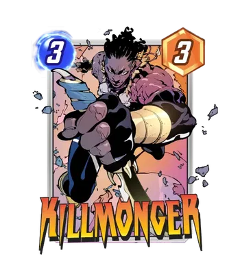
Our monthly Kim Jacinto sighting is here, and it doesn’t disappoint: it’s an incredibly dynamic piece, with Killmonger’s fist right in the your face, clutching a knife. More than just the forced perspective, Jacinto’s strength for shadow and mood are on full display, with the inks and light glare bringing the entire piece to life. It’s also a different, younger, more brash likeness for Killmonger, and that’s a really fitting interpretation for the character as we’ve seen. It’s by and far one of the most striking pieces in this mine, and I suspect bundle buyers will be months unto a flame for this one.
Brett Bean
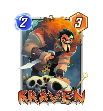
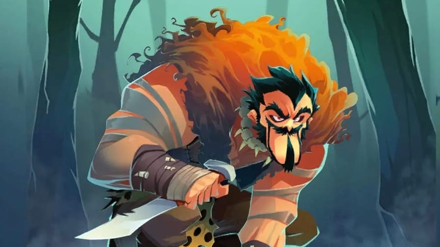
Brett Bean’s back! (I’m not going to get tired of saying that; expect it again.) And he continues to be a completely refreshing addition to SNAP’s roster, packing a level of character into these variants that we very rarely see. Kraven’s big brow and devious smirk has rarely felt more distinct, and why not? He’s gone off to New York to hunt down a man in tights! I love the skulls in the foreground, the colors, the silhouette of it all— perhaps more subtly, I love the dark teal lighting off of his hair and the contrast it cuts with his big orange mantle. It’s a great, fun variant— and they know it, from the looks of that bundle.
Jon Lam
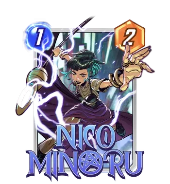
Jon Lam’s a cool artist— I really dig his colors especially, and that even with some of his work that stands out less, he’s got a really great command of his palette and how it works in lighting. This Nico might be the best out of his current work so far, giving us some great forced perspective with her hand and the Staff of One and a lot of energy coming from all that magic lightning. It’s kind of interesting to see how commissioned pieces will often use the base art as a style-guide more closely than these characters might otherwise require— just like her Creative House Pocket variant, Lam’s Nico is sporting the same tealish color streak as her base art. Anyways, it’s great, and, while Nico isn’t strapped for variants, it’s always nice to see more.
Eduardo Mello (and Ryan Kinnaird)
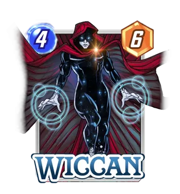
Finally, as a fun surprise, we’re getting what’s possibly the best Mello/Kinnaird combo I’ve ever seen! Now, unlike the above question-mark about whether or not Kinnaird colored the prehistoric Hawkeye, there’s no external reason to think there was a line error, other than this variant looking just much stronger than many other Kinnaird-colored variants. But we’ve seen more than enough diversity from Mello on other variants; there’s no reason not to extend that same diversity and benefit of the doubt to Kinnaird. And this Wiccan really does look great, with the striking shadow of his obscured face and the night-sky-as-bodysuit all providing a great contrast to all the other shiny effects going on. Maybe it’s that stark contrast (and entirely shadowed body) that’s playing to a different strength of Kinnaird’s here, but I don’t see nearly the same generic coloring/lighting that we normally see on many other variants he’s worked on. This is a blast, and I certainly would not be unhappy seeing this come out of a Spotlight cache for me.
New Commissioned Artists!
Stefano Simone
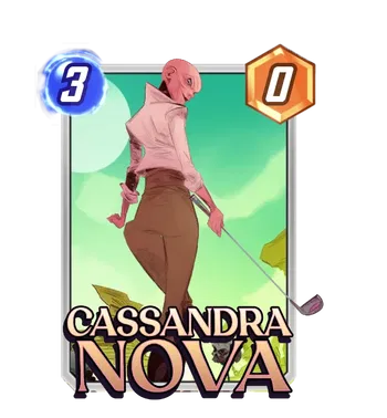
It’s pretty light on newcomers this round, but we do have a few; we’re kicking off with with Stefano, who’s got a background in comics but seems new to both Marvel and Marvel SNAP— our introduction to them will be this Cassandra Nova, who’s stylized in a fun way that captures her deviousness in both her expression and all the sharp edges that her outfit is making. The background is pretty simple, which makes the variant feel a bit spare as a whole, but I like the colors a lot, and I’m interested in seeing more from Simone down the line!
Tyler Walpole
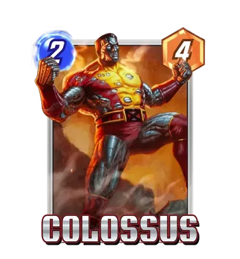
Tyler Walpole is new to SNAP too, though he’s drawn his fair share of these characters on his own time; he’s got a background illustrating Magic the Gathering cards, among other things, which means he joins the ranks of painted illustrators bringing SNAP cards to life. This Colossus feels old school in a lot of ways, giving us Piotr’s classic outfit and plenty of battle damage and steam coming off of him, revealing his impeccable organic steel musculature beneath. It doesn’t feel over the top, but it does feel grand in that way these illustrations often feel, and so I imagine many old-school fans of these characters will like this one a lot. Here’s to more Walpole soon!
César Vergara
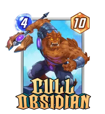
On the other side of the spectrum, César Vergara is coming from an illustrative background with Lorcana (the Disney trading card game), and he brings a similarly simplified, cartoon-esque sensibility in the same vein as Galloway, Bean, and so on. I don’t think this Cull Obsidian is the best work out of his, just looking through the catalogue; something about the flat colors and lack of really strong shadows or lighting really feel like they hold the piece back, but Vergara’s work in Lorcana doesn’t share the same weaknesses. I love the premise of casting Cull like a sort of monstrous ogre in a children’s book, and even if this doesn’t quite land for me, I’m hoping to see more of Vergara’s work bring some Lorcana charm to SNAP.
Gustavo Pelissari
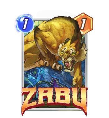
Wrapping this section up with a fantasy artist, Gustavo Pelissari is giving us a remarkably great Zabu, sneering any scavengers off of a dead dinosaur he no doubt brought down by his lonesome. Zabu feels so solid in this piece, with Pelissari bringing out so many of the wonderful shapes that work together to make up a sabre-toothed tiger. In my opinion, the strongest element is definitely Zabu’s brow, curling in such a real tiger-like way that I immediately checked Pelissari’s other work for at least one other tiger with a similar hallmark. (He’s done them; they look great.) I’m really looking forward to more Pelissari, if that’s in the cards for Second Dinner.
Pulled Straight From The Stands!
Pablo Villalobos’ Venom (2021) #27 Variant Cover
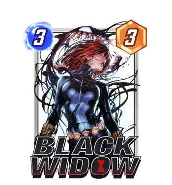
Of course, one of these articles wouldn’t be complete without a quick research check to see which of these great pieces come straight from the comics! We’ll start with this great Black Widow piece that’s quickly become one of the more circulated covers I’ve seen for Natasha— perhaps because the combination of Black Widow and the symbiote is just a great combo. (It’s what happens, more or less, in these issues of Venom!) Villalobos’ work on this cover is equal parts dramatic and fun, with Black Widow’s fallen figure contrasting Venom’s goofy grin, and it’s no strange decision that this is going to be an Ultimate variant for the diehards out there.
Sergio Fernández Dávila’s Carnage (2023) #4 Variant Cover
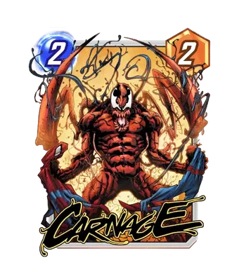
Next, we’ve got a Carnage cover by Sergio Fernández Dávila from the recent Carnage series; SNAP continues to draw on a variety of back issues, and it’s always a bit of a welcome surprise to me to see how recent some of the pulls are. There’s a bit of an homage to the classic cover of Amazing Spider-Man #238, with Hobgoblin ripping Spider-Man’s suit apart, and it’s probably even more fitting that a lunatic like Carnage here is doing the deed. Fun, violent stuff!
Artgerm’s Scream: Curse of Carnage (2019) #1 Variant Cover
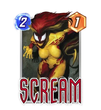
Continuing the Carnage train, we’ve got a piece from Scream: Curse of Carnage #1 next, bringing us SNAP’s next Artgerm by way of variant cover! It’s a fun thing to see Artgerm’s talent for pin-up style portraits and faces turned towards a fully ‘masked’ character like Scream, and it pays off— Artgerm’s skill in lavish rendering turned towards a graphic design like Scream’s is a fun combo, making those colors pop under a spotlight. Scream’s had some fun covers from this era (owing to the events all happening around that time) and I’m glad to see this one get into the game; I’m looking forward to more!
Rick Berry’s Eternals (2006) #2 Variant Cover
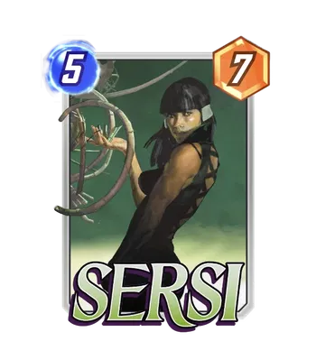
Rick Berry’s a huge illustrator who, almost two decades ago, leant his cover skills to the Eternals series. It deserves the warning now that it’s penned by Neil Gaiman, but that deserves no place here— we’re here to talk about Berry’s phenomenal Sersi cover, which has all the hallmarks of awesome sci-fi illustration, putting a mysterious Sersi looking over her shoulder as she manipulates some strange device (the Marvel Universe is full of them). It’s hard to not say ‘just look at it’ when it comes to singing this piece’s praises, but there’s so much life in the musculature and lighting around Sersi, and so much mood and intrigue in shadows framing her face. Berry’s got phenomenal covers for the entire series, and it would not be remiss at all for Second Dinner to try and bring the other covers into the game.
Frank Cho’s Shanna, the She-Devil (2005) #1 Variant Cover
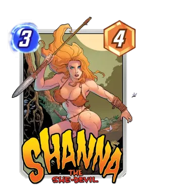
This one was actually unmarked in datamines for the artist credit, but we all know I’m a snoop; it wasn’t hard to verify that this was Frank Cho’s cover for Shanna, the She-Devil back in 2005, and it’s an easy style match to draw! Frank Cho doesn’t shy away from the cheesecake side of comic art— indeed, he’s arguably a figurehead for it, never shying away from a full-bodied physique and leaning into comics’ oft-exaggerated proportions. But where many artists have a lot less under that veneer of exaggeration, Cho’s got real chops backing it up, as a veteran’s veteran comic artist. It’s great to see some comic work for Shanna, and Cho’s talent for an attractive woman on the cover of a comic is pretty undeniable— and the colors, lighting, and motion of the piece are all working great, too. I’m sure that folks are going to be drawn to conversations about Cho’s style, whether that brand of cheesecake is for them or not, but for what it’s worth he’s another strong artist to elevate SNAP’s roster of variants.
Dan Panosian’s Eternals (2021) #1 Variant Cover
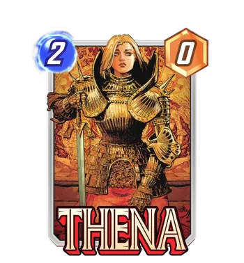
Nearing the end here, we’ve got another Eternals cover, this time much more recent: Dan Panosian’s depiction of an armored Thena, covered in gorgeously shadowed golden armor. Rounding out the Eternals’ variant catalog with pulls from the comics is huge, and Second Dinner is doing a bang-up job with the selection; Panosian knocks it out of the park here, and really brings a different silhouette to the the battle-hardened Eternal. That’s also a great result of pulling from the comics; sometimes compositions for commissions can feel extra same-ish, and like mentioned before with Nico, they’ll often adhere more closely to the base art in design. Indeed, Panosian’s work here is bringing some great variety to Thena’s selection, and it’d be wonderful to see any other pieces by him from the comics make their way over here.
Derrick Chew’s NYX (2024) #2 Variant Cover
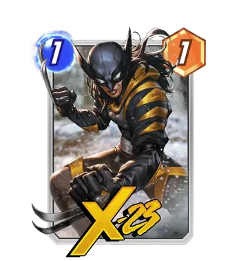
Wrapping this section up, we’ve actually got the most recent cover in this bunch— Derrick Chew’s variant for 2024’s NYX #2, giving us Laura Kinney’s latest look, which has a real street-wear sort of vibe with its baggier material and oversize collar. It’s stylish and cool and brought to life with really great rendered textures, and Laura’s expression helps tie the whole piece together as someone not to be SNIKT’ed with. It’s a really sick departure from the more general male-gazey compositions that Chew’s done, too, at least that have come to SNAP— a welcome chance to see the broader range of what a talented artist like Chew can do.
Staple Studio Work
PANDART
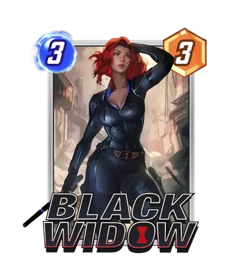
Finally, outside of Envar, this patch has got a handful of additions from other studios, though not in the same deluge that we saw in the last couple. First off, Black Widow gets another variant, this time from PANDART— as if she hasn’t gotten enough love already! This one seems to draw its outfit a little more closely from the MCU, or, at least, the MCU’s sensibility for textured costumes. It’s got those little colored lines and the shades of blue in the collar, and perhaps a neck that’s a tad long. But the piece is overall quite beautiful, with her face painted with more nuance than we sometimes see in PANDART’s work.
ADIA
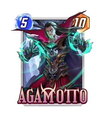
Agamotto seems to be getting a bonus variant from ADIA that the other March cards don’t have, and even thought it isn’t marked as such, it seems in the same vein as their Nightforged line, with the gratuitous extra skulls and ominous spectral green light. It makes sense that Agamotto is the Season Pass card getting another variant in rotation, and the theme lines up perfectly well as well— a Sorcerer Supreme, doing occult, spooky things. So it’s fun! And spiritually aligned with ADIA’s Nightforged work, if not literally. I’m not sure if the series is tied to perhaps a specific artist at the studio; either way, fans will likely scoop this one up without too much discernment anyways.
Jelly Pixel
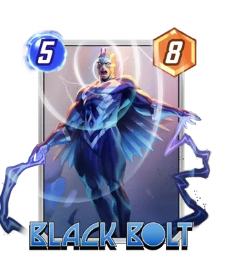
I’ve resigned myself to assuming Jelly Pixel is a studio as well and then eating the comeuppance when it inevitably comes out that they’re in fact a single person with a particular handle; until then, I’m going to assume they’re some sort of art collective. But they’re back! And this time with good ol’ Blackagar Boltagon, hovering and shouting in concentric circles as he is wont to do. It’s in that classic glossy, stylized look lots of studio work has, but to its credit the variant does some cool stuff with the back lighting haloing Black Bolt. Not bad at all!
SIXMOREVODKA
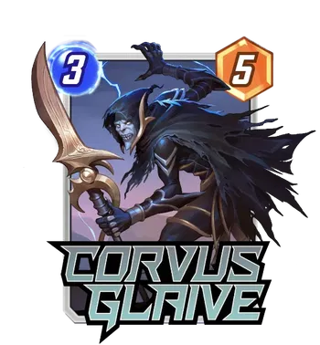
Members of the Black Order are in dire need of variants, on the whole; for how iconic Infinity War made them, there just isn’t the most cover-style art of them out there. But SIXMOREVODKA is stepping up to the plate, giving Corvus Glaive a higher fidelity (if not safe) variant for players hungry for some Glaive. It’s the classic look, which means the look from Infinity War, which more or less means the look from comics— and to be fair, that’s pretty much all anyone has to work with! So even if it’s not the most gutsy stylistic reimagining of the Wife Guy of the Black Order, it’s nice to see some love given to someone so variant-starved.
Creative House Pocket
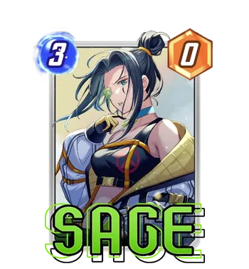

Creative House Pocket is a recent favorite for players, and I imagine that will continue with these next couple— I’ve already seen folks agonizing over whether they want the newest cute anime Sage. It’s not unreasonable! The anime style is always going to have diehards, and Creative House Pocket has proven quite competent at working in that style. But the real thing to be praised are their vibrant colors, which are really often the most striking part of their variants, and Shuri shows that off too! While I might be a bit more reserved about studio work like Creative House Pocket’s (and here is no exception) it’s fair to say they’re bringing a different flair from the folks over at, say, PANDART or Envar.
Studio Grafit
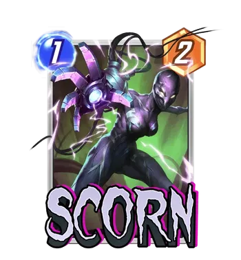
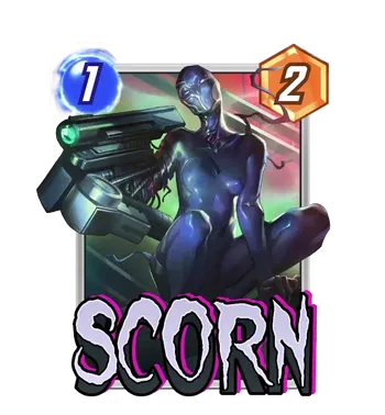
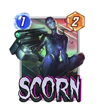
Lastly, Studio Grafit is back, and this time with some work done all on their own— rather than just a coloring job (like with Ludo Lullabi’s Abomination featured in the Super Premium pass now), this Scorn is done entirely in-house by them. Scorn is another under-featured character in the comics, and folks maybe less into painted pseudo-realism by the likes of Farro might enjoy this more stylized approach! And, well, if you wanted a robot arm, this is a variant with a robot arm. There’s something about this sort of rendering that, like I’ve said before, can make a piece feel a bit like a blurry mush (the soft shadows contribute, for sure) but the piece is growing on me: I really do like the pose quite a lot, and it leans into the cool, distinct aspects of a character who isn’t too well known, even now.
Whew!
You said it, section header. That was a lot! And, in case you didn’t catch wind, there’s a lot I’m excited about from above. So folks, mark on your calendars any variants you’re looking forward to— and let us know about them below! You already know my feelings, and I want this to be a mutual relationship. What’s your most anticipated variant? Which piece did I breeze through that you thought deserved more love? Drop a comment; and I’ll see you very soon for the more immediate variant forecast. But until then, TTFN— ta-ta for now!